plot_rmse
- plot_rmse(*args, ref=None, title_font_size=0.4, legend_font_size=0.35, y_max=None)
New in metview-python version 1.9.0
High level function with automatic styling to generate RMSE (root mean square error) curve plots from GRIB data.
- Parameters
ref (
Fieldset) – the reference GRIB data (typically it is an analysis)title_font_size (number) – specifies the font size in cm for the plot title
legend_font_size (number) – specifies the font size in cm for the plot legend
y_max (number) – specifies the maximum value for the y axis in the RMSE plot. When it is not specified the value is automatically determined from the data.
plot_rmse()is a convenience function allowing to generate RMSE curve plots in a simple way using predefined settings.The RMSE value for a given field f with respect to the corresponding field from
refcan be written as follows (N is the number of gridpoints in the field):\[rmse = \sqrt {\frac {1}{N} \sum_{i}^{N} (f_{i}-ref_{i})^{2}}\]The averaging in the formula above is carried out with
integrate().
Data
Plot style
The curve style is automatically assigned to each input data item. The title and the legend is automatically generated using the label attribute in the
Fieldsetdata in*argsandref. If a data item is part of aDatasetthe label is automatically set, otherwise it can be defined like this:an = mv.read("an.grib") an.label = "an"
Limitations
plot_rmse()is a high-level function using pre-defined settings, therefore it comes with certain limitations:
the curve style cannot be customised
the title and the legend cannot be customised
the horizontal axis cannot be customised
on the y axis the maximum value can be set via
y_maxbut everything else is automatically generated
Example with deterministic forecast
The following example shows how to create an RMSE curve plot with deterministic forecast data (geopotential on 500 hPa):
import metview as mv

# get data with 500 hPa geopotential
f = mv.gallery.load_dataset("z_rmse.grib", check_local=True)
an = f.select(type="an")
fc = f.select(type="fc")

# assign a label
an.label = "AN"
fc.label = "OPER"

# generate plot
mv.plot_rmse(fc, ref=an)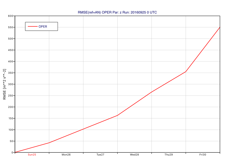
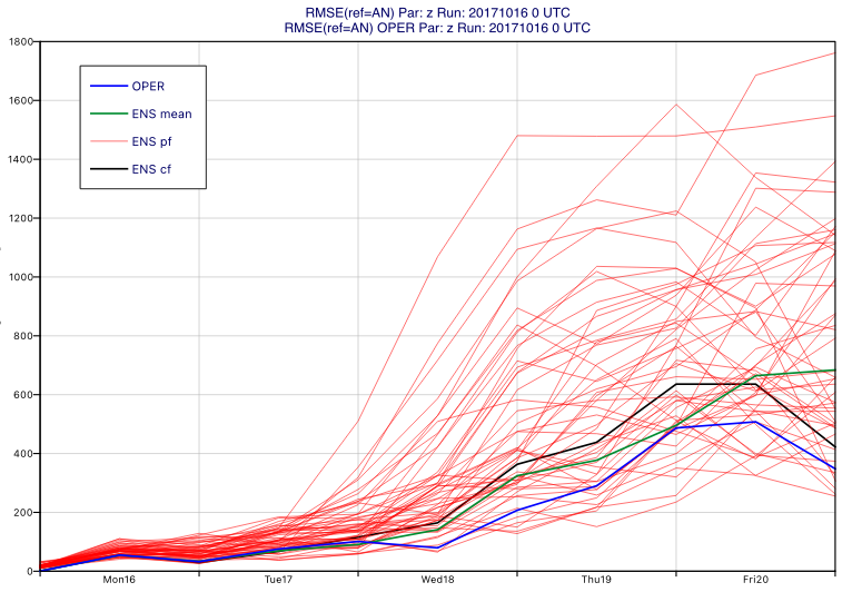
Example with ensemble forecast
The following example shows how to create an RMSE curve plot with ENS forecast data (geopotential on 500 hPa):
import metview as mv

# get data with 500 hPa geopotential
f = mv.gallery.load_dataset("ens_z_rmse.grib", check_local=True)
an = f.select(type="an")
fc = f.select(type="fc")
en = f.select(type=["cf","pf"])

# assign a label
an.label = "AN"
fc.label = "OPER"

# generate plot
mv.plot_rmse(en, fc, ref=an)