ECMWF New Users Metview Tutorial
Note
This tutorial was written for ECMWF’s Introduction for New Users course (COM_MARS and COM_INTRO) and shows how to retrieve data from MARS using Metview, perform some basic manipulations and plot the result.
Preparation
First start Metview; at ECMWF, you will need to load the ecmwf-toolbox module:
module load ecmwf-toolbox
Since we will also use a small amount of Python, you should also load the python3 module:
module load python3
Once that is done, the command to use is simply ‘metview’. You should see the main Metview desktop which looks something like Figure 1.
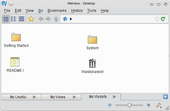
Figure 1 - the Metview desktop
In Metview, most operations can be performed via icons. All icons are available via the Create New Icon context menu of the Metview desktop.
You will create some icons yourself, but some are supplied for you.
If at ECMWF then you can copy it like this from the command line:
cp /perm/cgi/tutorials/metview_intro.tar.gz $HOME/metview/
Alternatively, you can download the following file and save it in your $HOME/metview directory:
You should see it appear on your main Metview desktop, from where you can right-click on it, then choose Extract/here to extract the files. You should now (after a few seconds) see a metview_intro folder which contains the icons we will work with (double-click on it to enter it). You should work in this folder, not the embedded solutions folder.
Exercise 1: forecast - analysis difference
This exercise shows how to retrieve GRIB data from MARS, examine its structure, compute the differences between fields and visualise the data in various ways.
Retrieving the analysis data
To perform a MARS retrieval in Metview, right-click on an empty area of the Metview desktop and select Create New Icon from the context menu. Select Mars Retrieval and hit Return or click OK. This will create a copy of the icon for you to customise. Rename the new icon to temperature_analysis by clicking on its name. Edit your icon (right-click & edit, see Figure 2) and set the following parameters:
Parameter |
Value |
Notes |
Param |
T |
Note: sets the desired meteorological parameter to Temperature |
Date |
-3 |
Note: sets the analysis base time to 3 days ago |
Grid |
1/1 |
Note: interpolates the result onto a 1.0-degree grid |
To save these settings and close the editor, click the OK button at the bottom-right of the icon editor.
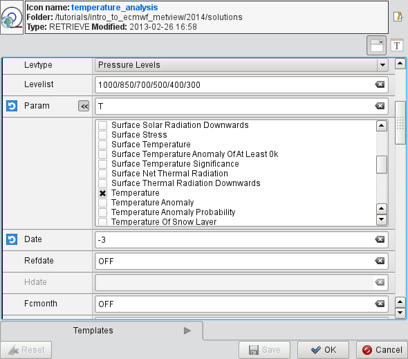
Figure 2 - the Mars Retrieval icon editor
Inspecting the analysis data
Perform the data retrieval by choosing Execute from the icon’s context menu. The icon name should turn orange whilst the retrieval takes place, then green to indicate success (if the name turns red, then the retrieval failed and you should look in the output log, available from the Log entry in the context menu). The data is now cached locally. To see what was retrieved, right-click Examine the icon. This brings up Metview’s GRIB Examiner tool (Figure 3). Here we can see that we retrieved six vertical levels of data; this is as expected if we look at the Levelist parameter in the icon editor.
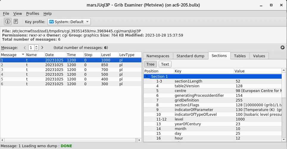
Figure 3 - the GRIB Examiner
Note
The GRIB Examiner allows in-depth examination of GRIB files with many ways to customise the information. We will not cover these facilities in this introduction.
Close the GRIB Examiner.
Now visualise the data, again using the icon’s context menu. You will see a map plot with the default contouring style in the Display Window (Figure 4). The zoom controls in the toolbar give control over the area selection.
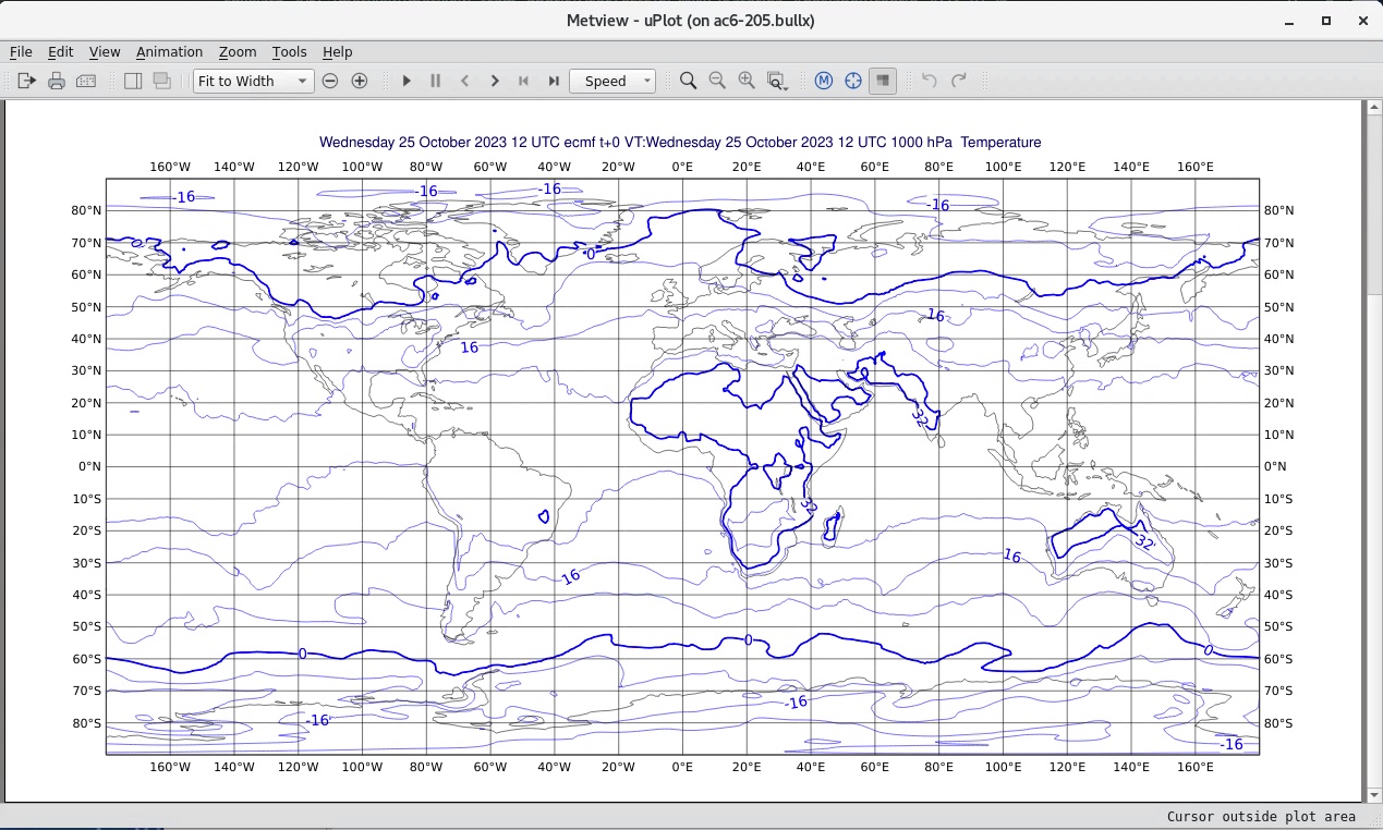
Figure 4 - a default map plot
To plot the data with shaded colours, create another new icon - this time select the Contouring icon. Rename it shade and edit it, providing these parameters:
Parameter |
Value |
Notes |
Legend |
On |
|
Contour Shade |
On |
|
Contour Shade Method |
Area Fill |
|
Contour Shade Max Level Colour |
Red |
Note: to select a colour, click the small triangle next to the parameter name to reveal the colour selection dialogue |
Contour Shade Min Level Colour |
Blue |
|
Contour Shade Colour Direction |
Clockwise |
Save the icon settings (OK) and drop this icon into the Display Window (re-visualise the data if you have closed the Display Window). The result should resemble Figure 5.
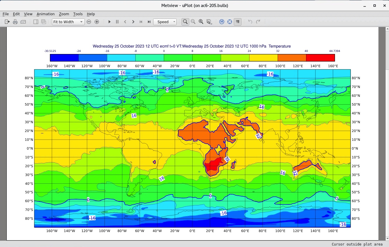
Figure 5 - map plot with shaded contours
Metview’s Contouring icon provides much flexibility in choosing how to display gridded fields; this tutorial uses only simple colour schemes.
The fields can be visualised using different views. These can be defined by a set of icons such as Geographical View and Cross Section View. In the solutions folder are 2 pre-prepared view icons for you to try. Visualise the polar_stereo_europe icon and drop your temperature_analysis icon into the resulting Display Window. If you edit this view icon, you will see how to define a geographical view. Now close the Display Window and visualise your data in the same way with the the cross_section_example view. This icon defines a geographical line along which a cross section of the data is computed (remember that the data consists of a number of vertical levels). You can also drop your shade icon into the plot (Figure 6).
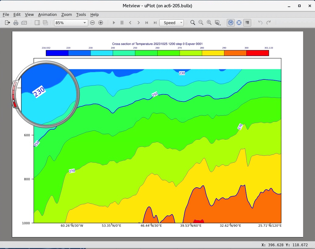
Figure 6 - cross section plot of data
Note
The Display Window provides a number of facilities for further inspection of the data (e.g. magnifier, point values, histogram), not covered here
Close the Display Window.
Retrieving the forecast data
In your original Metview directory create a copy of your temperature_analysis icon (right-click, Duplicate) and rename the copy to temperature_forecast. Edit this icon and set the following parameters:
Parameter |
Value |
Type |
FC |
Param |
T |
Date |
-5 |
Step |
48 |
Grid |
1/1 |
The analysis data was valid for 3 days ago; this new icon retrieves a 48-hour forecast data generated 5 days ago, so it is also valid for 3 days ago. You don’t need to separately execute and visualise the icon - if you visualise it, the data will automatically be retrieved first. The plot title will verify that this data is valid for the same date and time as the analysis data. It also contains the same set of vertical levels.
Compute the forecast-analysis difference
Create a new Simple Formula icon. Rename it to fc_an_diff. Edit the icon, ensure that the first FORMULA option is selected (F+G) and that the operator is minus ( - ). Drop your temperature_forecast icon into the Parameter 1 box, and drop temperature_analysis into the Parameter 2 box. Save the icon and visualise it. The difference will be computed and the result plotted. Note that all 6 fields in each data icon are used in the computation - the result is a set of 6 fields. The solutions folder contains two Contouring icons which can be used to show the differences: select both pos_shade and neg_shade with the mouse and drop them both together into the Display Window (see Figure 7). It is also possible to drop them one at a time, but they do not accumulate - one will replace the other. Alternatively, drop the anomalies_shade icon into the Display Window for an alternative plotting using only one icon.
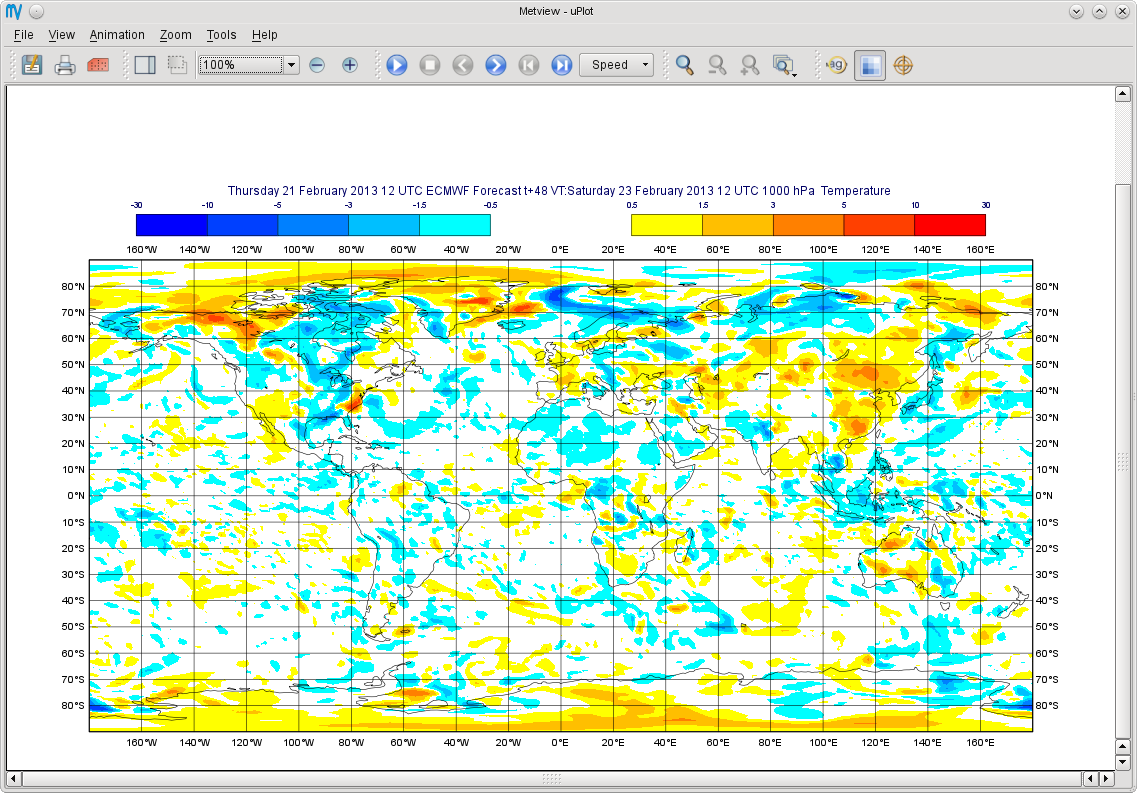
Figure 7 - difference plot with two contour icons
Automating the whole procedure
We will now let Metview generate a small Python script to perform all of this automatically. Right-click on an empty part of the Metview desktop and select ‘Create new Python script’. You can rename it to something like plot_fc_an_diff.py. Edit this icon - you will see an almost-empty code editor. Drop your fc_an_diff Simple Formula icon into this editor; the equivalent Python code will be generated for you! Now drop the anomalies_shade icon from the solutions folder into the Python editor (make sure it lands after the existing code). Now all you need to do is add a plot command at the end of the code. Taking care to ensure that the variable names are the same as the ones in your editor, type this line at the end:
mv.plot(fc_an_diff, anomalies_shade)
Run the script to obtain the plot, either by using the Run button from the Python Editor, or by selecting Execute from the icon’s context menu. By default, the plot command will produce an interactive plot window; we will see later how to generate a PDF file instead.
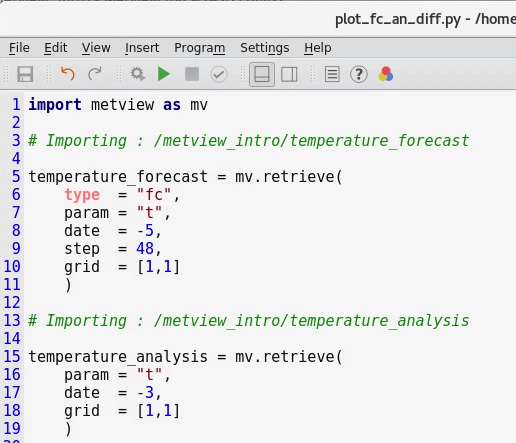
Figure 8 - automatically generated Python code
Note
Metview Python is a rich, powerful Python library designed for the high-level manipulation and plotting of meteorological data. It can be used in an interactive Metview session such as this, or as a standalone Python script or in a Jupyter notebook. For examples of the available functions, see Python API. The code generated automatically above is intended as a starting point only - usually at least some editing will be required in order to make the code more streamlined for your needs.
Exercise 2: forecast - observation difference
This exercise builds on Exercise 1, but uses observation data in BUFR format instead of analysis fields.
Retrieving the observation data
Create a new Mars Retrieval icon and rename it to obs. Edit it and set the following parameters in order to retrieve BUFR observation data from 3 days ago:
Parameter |
Value |
Type |
OB |
Repres |
Bufr |
Date |
-3 |
Retrieve the data and examine it. Metview’s BUFR Examiner displays the contents of the BUFR data (Figure 9). Each message contains many measurements.
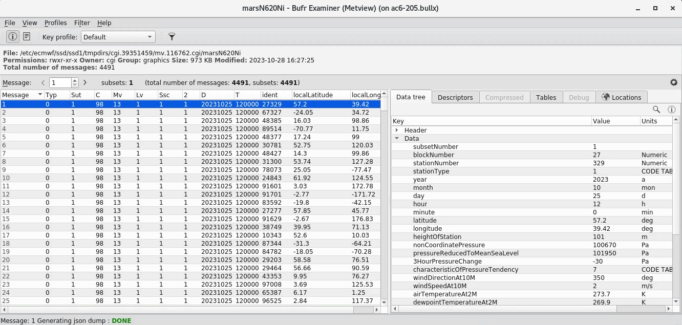
Figure 9 - the BUFR Examiner
If you visualise the data, you will see a standard display of synoptic observations. Figure 10 shows this, using the shaded_coastlines icon from the solutions folder (this plot has also been zoomed to show a smaller area).
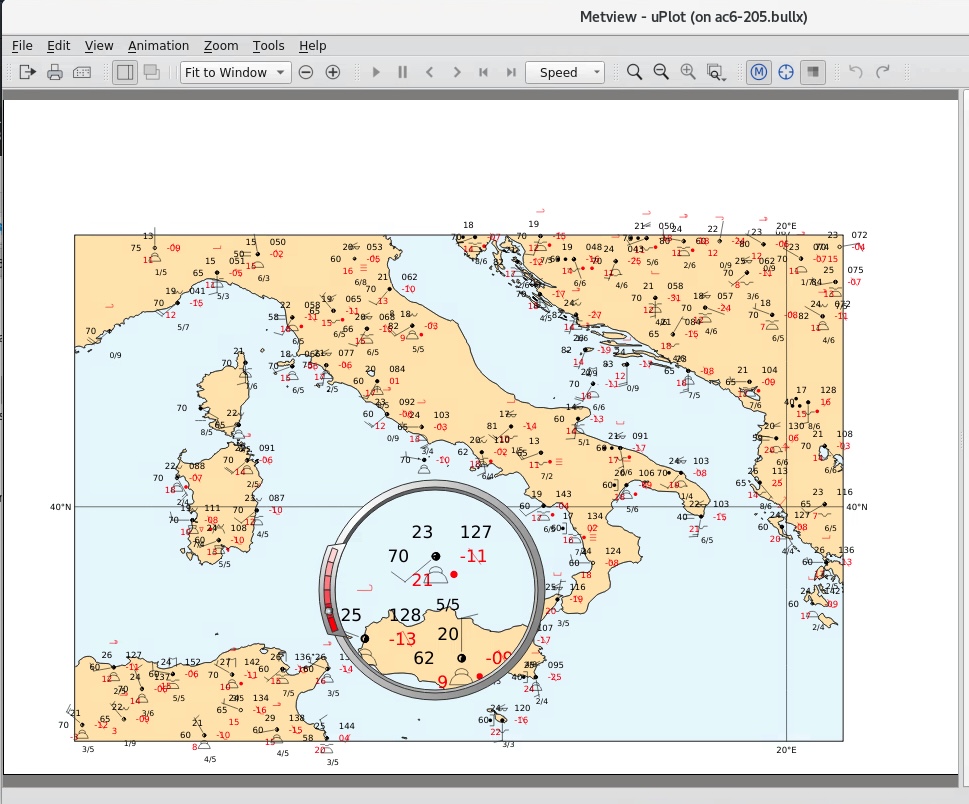
Figure 10 - synoptic observation plotting
Extracting the 2 metre temperature
Create a new Observation Filter icon and rename it to filter_obs_t2m. With this icon we will extract just the 2m temperature into Metview’s custom ASCII format for scattered geographical data - geopoints. Set these parameters:
Parameter |
Value |
Data |
Drop your obs icon here |
Output |
Geopoints |
Parameter |
airTemperatureAt2M |
Note
‘airTemperatureAt2M’ is not a random string - if you Examine the obs icon again and look at the right-hand panel, you will see a list of the available parameters. When you find airTemperatureAt2M, you can right-click on it and choose Copy item to copy its name to the clipboard.
If you examine the filter_obs_t2m icon now, you will see the result: a table of geo-located temperature values. When you visualise the data, you will see that the actual values are plotted as text on the screen; we can do better than this. From the solutions folder, drop the coloured_markers icon into the Display Window. The shaded_coastlines icon may also help make the points easier to see (Figure 11).
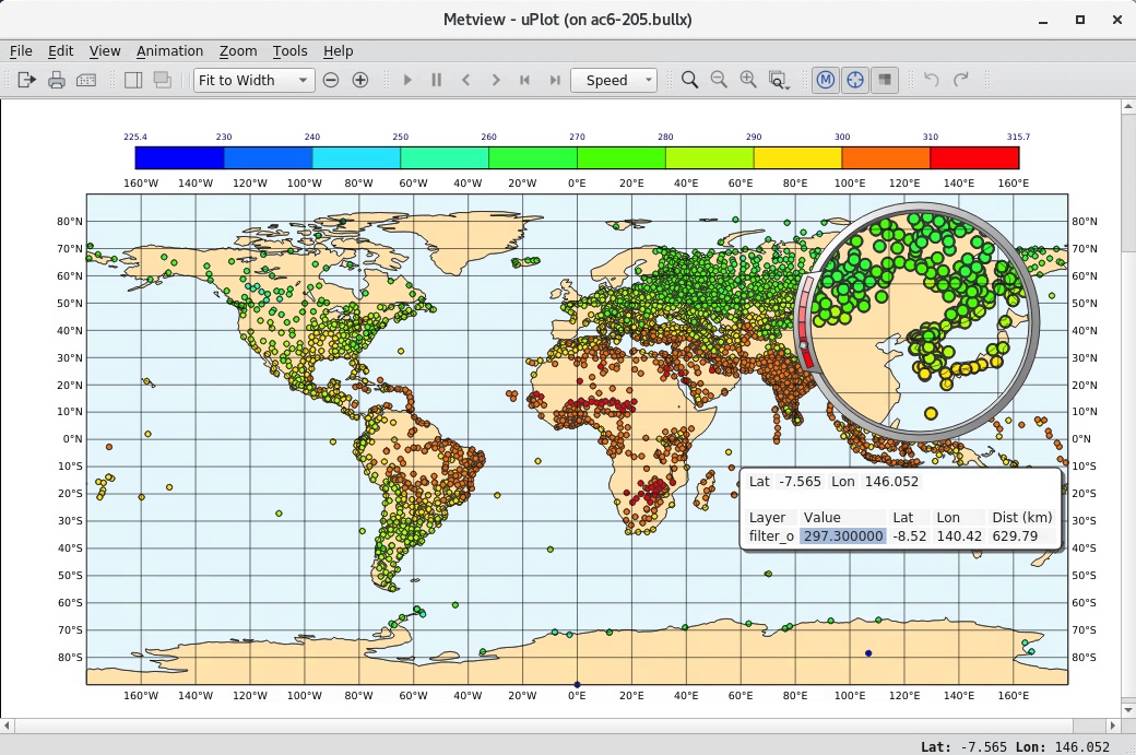
Figure 11 - 2m temperature observations
Retrieving the forecast data
Create a new Mars Retrieval icon, rename it to t2m_forecast, and set these parameters in order to retrieve the 48-hour forecast made 5 days ago for 2-metre temperature. The result will be a single field.
Type |
FC |
Levtype |
Surface |
Param |
2t |
Date |
-5 |
Step |
48 |
Grid |
1/1 |
Computing the forecast-observation difference
This is just the same as in Exercise 1, using a Simple Formula icon; create a new one and rename it to fc_obs_diff. Drop t2m_forecast into the Parameter 1 box, and filter_obs_t2m into the Parameter 2 box. Visualise the result - you will see that the result of a field minus a scattered geopoints data set is another geopoints data set. For each geopoint location, the interpolated value from the field was extracted before performing the computation. From the solutions folder, drop both the diff_symb_hot and the diff_symb_cold icons together into the plot in order to get a more graphical representation of the result.
Overlaying data in the same plot
To plot the forecast field together with the observation differences, do the following. Visualise t2m_forecast and drop the shade icon into the plot. Now drop fc_obs_diff into the plot, followed by (or with) diff_symb_hot and diff_symb_cold. The observation differences don’t stand out well against the strongly coloured field, so drop shade_light into the plot to obtain something like Figure 12.
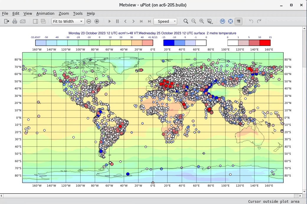
Figure 12 - temperature forecast field with obs-forecast differences overlaid
Exercise 3: explore the Gallery
Metview’s documentation includes a large gallery of examples that illustrate how to work with different data types,
perform various computations and and produce many types of plots.
Select one or two of these examples, copy their code into a new Python script inside Metview, inspect the code and run it.
These examples all generate their plots as PDF files by calling the setoutput() function. You can instead generate
an interactive on-screen plot by simply commenting out this line.