Note
Click here to download the full example code
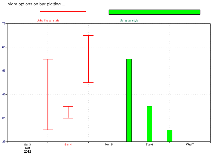
Bar Chart Plotting
# (C) Copyright 2017- ECMWF.
#
# This software is licensed under the terms of the Apache Licence Version 2.0
# which can be obtained at http://www.apache.org/licenses/LICENSE-2.0.
#
# In applying this licence, ECMWF does not waive the privileges and immunities
# granted to it by virtue of its status as an intergovernmental organisation
# nor does it submit to any jurisdiction.
#

# ------------------------------------------------------------------
# Demonstrates how to plot time series vectors using linebars
# and bars in a Cartesian view.
# ------------------------------------------------------------------

import metview as mv

# set up the axis for the cartesian view
my_vaxis = mv.maxis(
    axis_tick_label_height=0.40,
    axis_orientation="VERTICAL",
    axis_grid_thickness=1,
    axis_type="REGULAR",
    axis_tick_label_colour="NAVY",
    axis_grid="ON",
    axis_grid_line_style="DOT",
    axis_grid_colour="GREY",
)

my_haxis = mv.maxis(
    axis_orientation="HORIZONTAL",
    axis_grid_thickness=1,
    axis_type="DATE",
    axis_days_label_height=0.40,
    axis_grid="ON",
    axis_months_label_height=0.40,
    axis_years_label_height=0.50,
    axis_grid_line_style="DOT",
    axis_grid_colour="GREY",
)

my_view = mv.cartesianview(
    x_axis_type="DATE",
    x_date_min="2012-03-03 00:00:00",
    x_date_max="2012-03-08 00:00:00",
    y_axis_type="regular",
    y_min=25,
    y_max=75,
    horizontal_axis=my_haxis,
    vertical_axis=my_vaxis,
    subpage_y_length=70,
)

# define first set of input vectors to plot
my_dates1 = ["2012-03-04 00:00:00", "2012-03-04 12:00:00", "2012-03-05 00:00:00"]
my_input1 = mv.input_visualiser(
    input_plot_type="xy_area",
    input_x_type="date",
    input_date_x_values=my_dates1,
    input_date_x2_values=my_dates1,
    input_y_values=[30, 35, 50],
    input_y2_values=[60, 40, 70],
)

# set up a linebar plot for the first set
my_graph1 = mv.mgraph(
    graph_type="BAR",
    graph_bar_colour="RED",
    graph_bar_style="LINEBAR",
    graph_bar_line_colour="RED",
    graph_bar_justification="RIGHT",
    graph_bar_width=6 * 3600,
    graph_bar_line_thickness=4,
    graph_bar_annotation_font_size=0.40,
    graph_bar_annotation=["<font colour='red'>Using linebar style</font>"],
    legend="ON",
)

# define second set of input vectors to plot
my_dates2 = ["2012-03-06 00:00:00", "2012-03-06 12:00:00", "2012-03-07 00:00:00"]
my_input2 = mv.input_visualiser(
    input_plot_type="xy_area",
    input_x_type="date",
    input_date_x_values=my_dates2,
    input_date_x2_values=my_dates2,
    input_y_values=[60, 40, 30],
    input_y2_values=[00, 00, 00],
)

# set up a bar plot for the second set
my_graph2 = mv.mgraph(
    graph_type="BAR",
    graph_shade_colour="GREEN",
    graph_bar_annotation_font_colour="CHARCOAL",
    graph_bar_justification="CENTRE",
    graph_bar_width=3 * 3600,
    graph_bar_annotation_font_size=0.40,
    graph_bar_annotation=["<font colour='evergreen'>Using bar style</font>"],
    legend_user_text=" ",
    legend="ON",
)

# set up the title
my_title = mv.mtext(
    text_font_size=0.6,
    text_lines=["More options on bar plotting ..."],
    text_justification="LEFT",
    text_colour="CHARCOAL",
)


# define the output plot file
mv.setoutput(mv.pdf_output(output_name="graph4"))

# plot the cartesian graph
mv.plot(my_view, my_input1, my_graph1, my_input2, my_graph2, my_title)