ODB Tutorial 1
This tutorial explains how to work with ODB in Metview.
Note
Please note that this tutorial requires Metview version 4.1.1 or later.
Preparations
Note
Please note that this tutorial was designed to be used only at the ECMWF.
First start Metview; the command to use is metview (see Metview at ECMWF for details of Metview versions). You should see the main Metview desktop popping up.
You will create some icons yourself, but some are supplied for you - please download the following file:
Alternatively, you can copy it like this from the command line:
cp /home/graphics/cgx/tutorials/odb_tutorial.tar.gz $HOME/metview
and save it in your $HOME/metview directory.
You should see it appear on your main Metview desktop, from where you can right-click on it, then choose execute to extract the files.
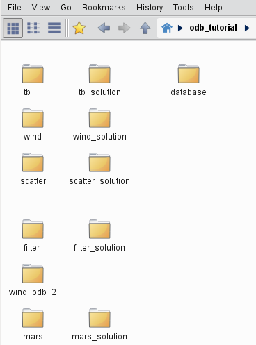
You should now (after a few seconds) see an odb_tutorial folder which contains the solutions and also some additional icons required by these exercises.
You will work in the odb_tutorial folder so open it up.
You should see the following contents:
The ODB Database Icon
In this exercise we will learn about the ODB Database icon and see how to examine its meta-data content.
The ODB Database Icon
Open folder ‘database’ inside your ‘odb_tutorial’ folder (double-click or right-click, edit). Here you will find all the ODB Database icons used in the tutorial.

These icons represent ODB databases residing on our file system. More precisely, in our case, these are only symbolic links to the databases to save disk space. Symbolic links can be really useful for working with the usually quite large ODB databases.
Note
To create a symbolic link right-click in the Metview desktop with no icons selected and choose Create new … from the menu. Please note that the text label under symbolic link icons is in italics.
Note
ODB database icons, like any other Metview icons, can be dragged and dropped between Metview folders. However, if the icon is not a symbolic link the whole data structure, which is usually very big, is copied/moved over during such an operation, so it might take a significant amount of time. On the contrary, for a symbolic link the link itself is copied over during a drag and drop operation so it is safe to use.
The ODB Binary Representations
ODB has two binary representations: there is the current format (ODB) which has a “flat” structure, and the older hierarchical format (ODB-1) which is stored in a directory structure instead of a single file. Metview uses the same icon for both ODB formats, hiding the differences between them and providing the users with an interface which is format-transparent. However, please note that wind plotting presently requires different approaches for the ODB and ODB-1 formats, respectively (see the wind plotting exercises (1, 2) for details on the differences).
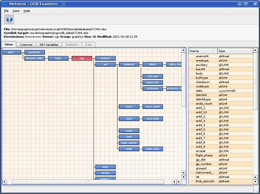
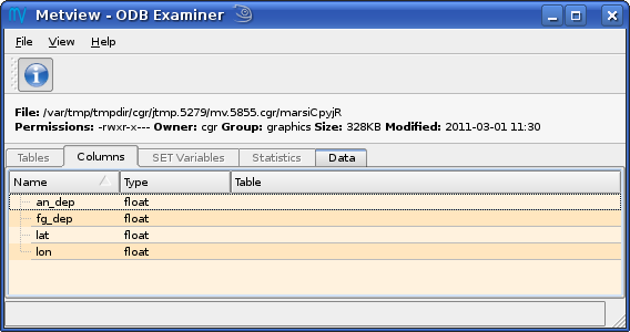
The ODB Examiner
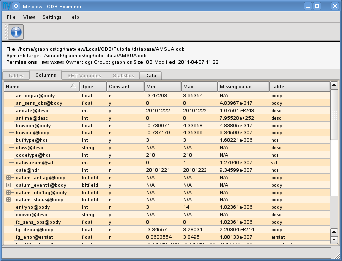
Right-click on your ‘CCMA.obs’ ODB Database icon and select examine from the icon menu. This will start the ODB Examiner application that displays the meta-data of the database. By default you should see the Tables tab of the interface showing the ODB table hierarchy. This hierarchy only exists only for the ODB-1 format (so we can see that our ‘CCMA.obs’ icon represents an ODB-1 database). By clicking on a table name the columns belonging to the selected table are displayed in the right hand side of the interface. There are two more tabs in the interface: the Columns tab showing the list of all the available columns and the SET Variables tab providing the users with the list of pre-defined ODB variables. Explore these tabs and then close the ODB Examiner
Now right click and examine icon ‘AMSUA.odb’. It points to an ODB database (just like icon ‘AIREP.odb’). Since there is no table hierarchy to be shown the list of all the available columns is displayed by default (Columns tab)
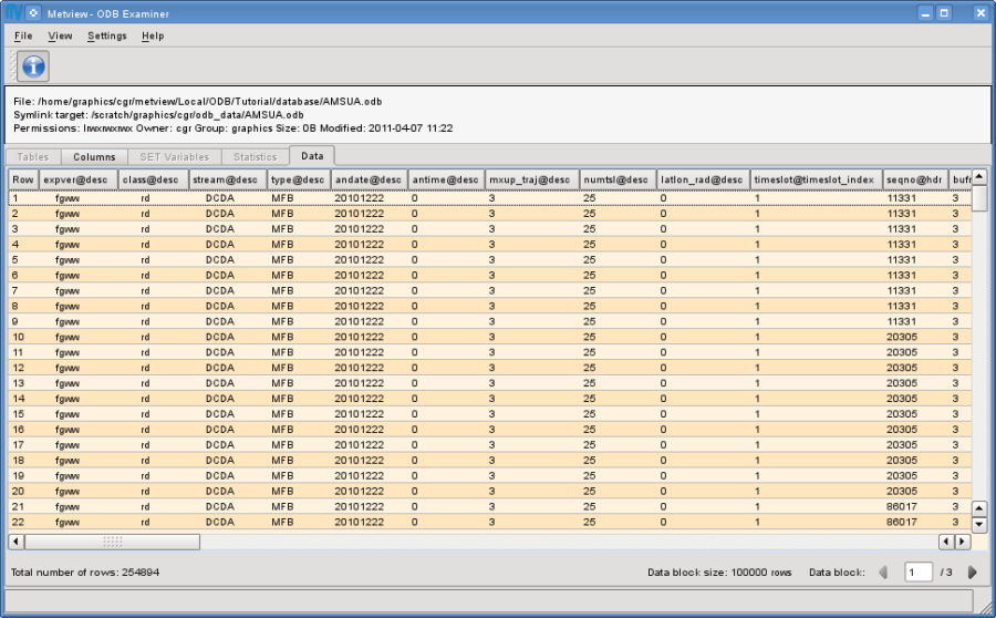
The data values stored in the ODB can be also inspected in the ODB Examiner (this feature does not work for ODB-1). Just click on the Data tab to see the data values. If there are too many values to be shown the ODB Examiner displays the data items in blocks. The actual size of the data blocks (in terms of rows) can be seen at the bottom of the interface next to the data block navigation buttons. Data blocks were introduced to reduce memory usage since the ODB Examiner has to keep in memory all the values shown in the Data tab.
Note
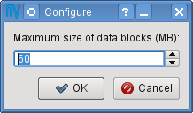
Each column in the Data tab can be sorted by clicking on the column heading. However, please note that sorting is enabled only if all the available data values can be displayed at once, i.e. no data blocks are to be used. By default the ODB Examiner starts splitting the data into data blocks if more than 60 MB is needed to store the data values in memory. You can override this default value in the Configure dialog available from the Settings menu in the menu bar.
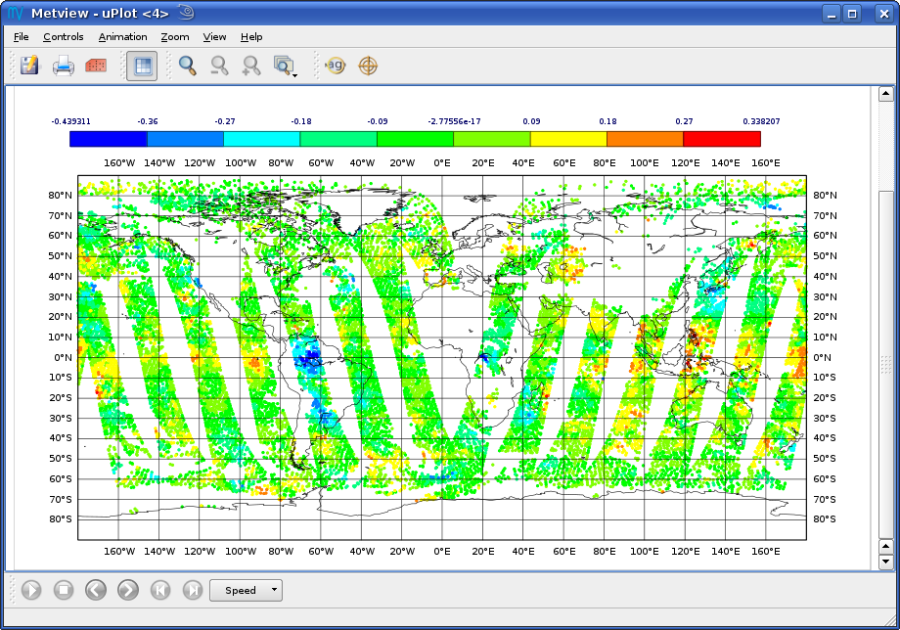
Symbol Plotting on Maps
In this exercise we will retrieve and plot the brightness temperature values for channel 5 from our ‘AMSUA.odb’ database. Please open folder ‘tb’ inside folder ‘odb_tutorial’ to start the work.
The ODB Visualiser Icon
The simplest way to plot ODB data in Metview is to use the ODB Visualiser icon.

It performs the query, defines which ODB columns should be interpreted as latitude, longitude and value(s) and specifies the plot type (symbol or wind plotting), as well.
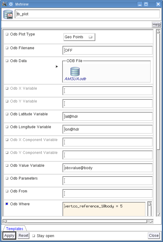
Create a new ODB Visualiser icon (right-click in the desktop when no icons are selected and use the New icon … menu) and rename it ‘tb_plot’.
First, open its editor and set Odb Plot Type to ‘Geo Points’ to indicate that we want to plot the values on a map.
Second, drop your ‘AMSUA.odb’ database icon into the Odb Data field. This specifies the database for which the query will be performed.
Third, specify the ODB/SQL query and the way the columns are interpreted to generate the plot. We want to perform the following query:
SELECT
  lat@hdr,
  lon@hdr,
  obsvalue@body
WHERE
  vertco_reference_1@body = 5
In the ODB Visualiser interface this query cannot be typed in directly but has to be split into the following individual items:
Odb Latitude Variable: |
specifies the name of the column holding the latitude data in the SELECT statement (here |
Odb Longitude Variable: |
specifies the name of the column holding the longitude data in the SELECT statement (here |
Odb Value Variable |
specifies the name of the column holding the value data in the SELECT statement (here |
Odb Where |
specifies the WHERE statement. In our example it is as follows:
|
Last, we have to specify the units of the geographical co-ordinates (here lat@hdr and lon@hdr) in the Odb Coordinates Unit field.
It is necessary since Metview requires geographical co-ordinates in degrees, but there is no general way to find out their units in an ODB database.
Instead an explicit declaration is needed from the users.
Our database stores co-ordinates in degrees.
So, to correctly interpret our co-ordinate values Odb Coordinates Unit should be set to ‘Degrees’ (which is the default value so we do not need to change it).
Having finished the modifications your icon editor should look like this:
Note
Remarks
1. The ODB database for which the query is performed can be alternatively specified by the database path via the Odb Filename input field. Please note that the typed-in database path is only used by Metview if no database icon is present.
2. The maximum number of rows accepted in the ODB retrieval is specified in the Odb Nb Rows input field. By default (-1) there is no upper limit for the number of rows.
3. If column latlon_rad@desc is available in an ODB (it is defined for our ‘AMSUA.odb’ database) it tells us the geographical co-ordinate units.
Its 0 value indicates degrees while 1 means radians (you can use the ODB Examiner to check this value for our database).
Besides, it is worth mentioning that all ODBs retrieved from MARS, as a generic rule, use degrees as geographical co-ordinate units.
Running the Query
Save your ODB Visualiser icon (Apply) then right-click and execute to run the query.
Within a few seconds the icon should turn green indicating that the retrieval was successful and has been cached.
Now your icon behaves exactly like an ODB Database icon.
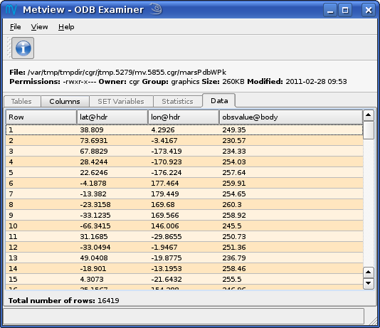
Right-click examine to look at its content.
You can see that the resulting ODB contains only three columns: lat@hdr, lon@hdr, obsvalue@body.
By clicking on the Data tab you can even see the data values.
Visualising the Output
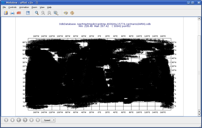
Right-click and visualise the icon to plot the retrieved data (please note that you can directly visualise the icon by skipping the execute step). This will bring up the Metview Display Window using the default visualisation assigned to symbol plotting. By default the data values are plotted to the map. Unfortunately, it is not the desired visualisation in our case (we cannot even see the satellite tracks) so we will further customise the plot.
We will change the plot by using markers instead of numbers and change the colour, as well. Let’s create a new Symbol Plotting icon (right-click in the desktop when no icons are selected and use the New icon… menu):

Rename it ‘symbol’ then edit it, by setting the following parameters:
Legend |
On |
Symbol Type |
Marker |
Symbol Table Mode |
Advanced |
Symbol Advanced Table Max Level Colour |
Red |
Symbol Advanced Table Min Level Colour |
Blue |
Symbol Advanced Table Colour Direction |
Clockwise |
Symbol Advanced Table Marker List |
3 |
Symbol Advanced Table Height List |
0.15 |
Now drop this icon into the plot to see the effect of the changes.
We used the Symbol Table Mode in our icon and set it to ‘Advanced’ which enabled us to automatically define intervals with a separate maker type, colour and size. These settings work in a similar way as in the Contouring icon.
Our palette was automatically generated from a colour wheel

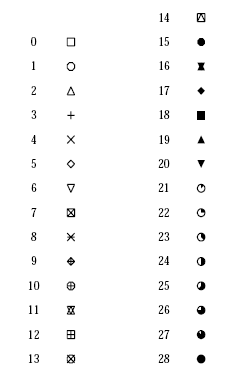
by interpolating in clockwise direction between Symbol Advanced Table Min Level Colour and Symbol Advanced Table Max Level Colour. The identifiers of the available symbol markers are summarised in the table below.
Note
Please note that the rendering speed of the markers can be significantly different and using a simpler symbol (in terms of rendering) can greatly reduce the plotting time. For example, the usage of marker 3 (plus sign) can result in much faster plot generation than that of marker 15 (filled circle).
Changing the Default Symbol Plotting Icon
Since the visual change is so useful (and the rendering process is much faster, as well) we will now make the settings of our ‘symbol’ icon the defaults for symbol plotting in Metview.
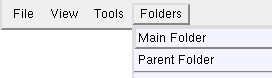
Open your main Metview folder (select item ‘Main Folder’ from the Folders menu in the menu bar of the Metview Desktop)
Open the subfolder called ‘System’ and then subfolder ‘Defaults’.
Do one of the following: edit the Symbol Plotting icon in the ‘Defaults’ folder to specify your new settings or else delete it and copy your ‘symbol’ icon into this folder then rename it ‘Symbol Plotting’
For information: To delete an icon, right-click, delete; to move an icon between folders, drag it with the left mouse button; to copy an icon between folders, drag it with the middle mouse button.
Save your changes and visualise your ODB Visualiser icon again - your new default symbol plotting attributes are automatically applied.
Now close your ‘Defaults’ folder.
Having a Histogram in the Legend
So far we have used the default legend settings, which resulted in a continuous legend. Now we will change our legend so that it could display a histogram showing the data distribution across the data intervals used in the symbol plotting.
Let’s create a new Legend icon:

Edit it, by setting the following parameter:
Legend Display Type |
Histogram |
Now drop the icon into the plot to see how the legend has been changed: it now contains an additional area holding the histogram.

Fixing the Symbol Plotting Intervals
Now zoom in and out of different areas. What happens to the palette - does it stay constant? The default behaviour is to create 10 interval levels within the range of data actually plotted. As the area changes, so does the range of values being plotted. Let’s create a palette which will not be altered when we change the area. Copy your ‘symbol’ icon (either right-click + duplicate, or drag with the middle mouse button), and rename the copy ‘symbol_fixed’ by clicking on its title. Edit the icon and make the following changes:
Symbol Advanced Table Selection Type |
Interval |
Symbol Advanced Table Min Value |
220 |
Symbol Advanced Table Max Value |
270 |
Symbol Advanced Table Interval |
5 |
Now when you apply this icon you will see that the palette is fixed wherever you zoom.
Changing the Title
The title of the ODB plot was automatically generated. It contains the database name (in this case it is a temporary file, the result of the query) and some statistics. To use a custom title we need a Text Plotting icon. This time you do not need to create a new icon since there is one called ‘title’ already prepared for you. Edit this icon to see how the title is constructed. Then simply drag it into the Display Window and see how your title has been changed.
Inspecting the Data Values
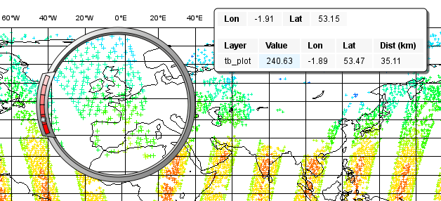
Data values at the cursor position can be inspected with the Cursor Data Tool, which can be activated by pressing on the gun-sight icon in the toolbar of the Display Window. The Cursor Data Tool displays the co-ordinates of the current cursor position and the information for the nearest data point to this position.

You may find hard to use the Cursor Data Tool for ODB since it is complicated to properly position the cursor in data dense regions in the plot. To overcome this difficulty you need to launch the Magnifier by pressing on the magnifier icon in the toolbar and navigate it to your area of interest in the plot.
Now if you move the cursor inside the magnifying glass it is significantly easier to distinguish the individual data points since you navigate the cursor inside a closed-up region.
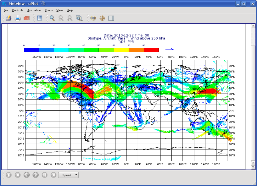
Wind Plotting on Maps
In this exercise we will retrieve and plot wind vectors for aircraft data above 250 hPa using the ODB Visualiser icon.
Note
Please note that the ODB Visualiser icon needs to retrieve both wind components within a single ODB/SQL query. This type of query is working fine for ODB-1 databases. However, it is only working for ODB databases if the wind components are stored in different columns (but this is not the general case). Therefore we will demonstrate wind plotting here with an ODB-1 database (‘CCMA.obs’) and show an alternative way for ODB data here.
Writing a Wind Data Query
In our ‘CCMA.obs’ database the u and v wind component values are stored in the same column (obsvalue) strictly following each other. It means that a u value is always followed by a v value in the database. To gain access for the u and v values independently we need a way somehow to refer to the next row in the database. This can be done by adding the #1 suffix to the column names in question. So our query to retrieve wind vectors for aircraft data above 250 hPa can be written as:
SELECT
  lat@hdr,
  lon@hdr,
  obsvalue@hdr,
  obsvalue@hdr#1
FROM hdr, body
WHERE
  obstype@hdr = 2 and
  varno@body = 3 and
  varno@body#1 = 4 and
  vertco_reference_1@body < 25000
Here the u wind component data is specified by obsvalue@body (with varno@body=3) while the v wind component data comes from the next row specified by obsvalue@body#1 (with varno@body#1=4).
Creating an ODB Visualiser Icon
Now open folder ‘wind’ inside your ‘odb_tutorial’ folder. Create a new ODB Visualiser icon and rename it ‘wind_plot’. Open its editor and set ODB Plot Type to ‘Geo Vectors’ to indicate that we want to plot vectors on a map. Then, change the icon to perform the query specified above for the ‘CCMA.obs’ icon located in this folder. This can be done in a similar fashion to our symbol plotting example. The main difference is that this time we plot wind data, so we need to work with the u and v wind components instead of scalar data values.
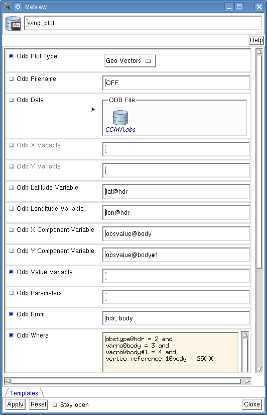
First, drop your ‘CCMA.obs’ ODB Database icon into the Odb Data field. This defines the database for which the query will be performed.
Second, we need to specify the query by setting the following individual items:
Odb Latitude Variable |
specifies the name of the column holding the latitude data in the SELECT statement (here |
Odb Longitude Variable |
specifies the name of the column holding the longitude data in the SELECT statement (here |
Odb X Component Variable |
specifies the name of the column holding the u wind component data in the SELECT statement (here |
Odb Y Component Variable |
specifies the name of the column holding the v wind component data in the SELECT statement (here |
Odb Value Variable |
specifies the name of the column whose values will be used to generate the colour palette for the wind plotting. We leave this item empty because it instructs Metview to use the wind speed for this purpose. |
Odb From |
specifies the FROM statement (it is only needed for ODB-1 databases). |
Odb Where |
specifies the WHERE statement. In our example it is as follows: obstype@hdr = 2 and
varno@body = 3 and
varno@body#1 = 4 and
vertco_reference_1@body < 25000
|
Last, Odb Coordinates Unit has to be set to ‘Radians’ since our database stores geographical co-ordinates in radians. Having finished editing your icon editor it should look like the picture on the previous page.
Running the Query
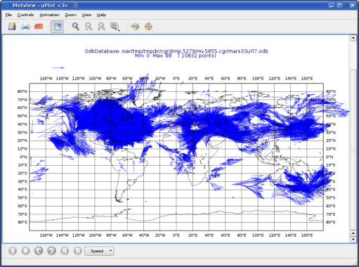
Save your ODB Visualiser icon (Apply) then right-click and execute to run the query. Within a few seconds the icon should turn green indicating that the retrieval was successful and has been cached. Now your icon behaves exactly like an ODB Database icon. Right-click examine to look at its content.
Visualising the Output
Right-click and visualise the icon to plot the retrieved data (please note that you can directly visualise this icon by skipping the execute step). This will bring up the Metview Display Window using the default visualisation assigned to wind plotting (your default settings might be different to the one used to generate this plot).
We will change the plot by applying a colour palette according to the wind speed and change the wind arrow size and thinning, as well.
Let’s create a new Wind Plotting icon:

Rename it ‘colour_wind’ then edit it, by setting the following parameters:
Wind Field Type |
Arrows |
Wind Advanced Method |
On |
Wind Arrow Unit Velocity |
50 |
Wind Thinning Factor |
1.0 |
Wind Advanced Colour Max Level Colour |
Red |
Wind Advanced Colour Min Level Colour |
Blue |
Wind Advanced Colour Direction |
Clockwise |
Now drop this icon into the plot to see the effect of the changes.
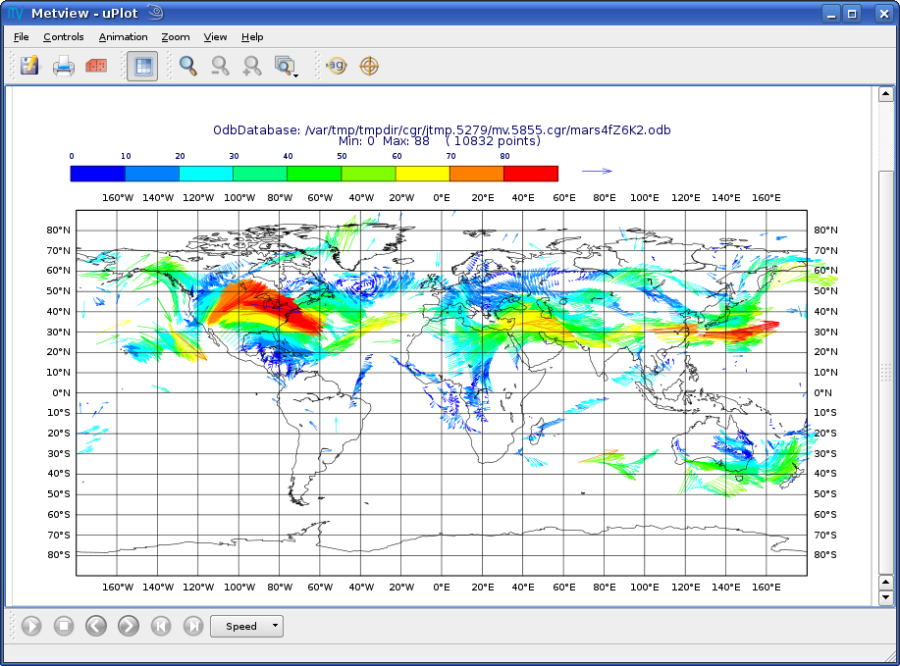
We used the Wind Advanced Method in our icon that enabled us to automatically define wind speed intervals and assign a nice palette to them. These settings work in a similar way to the Contouring icon. Please note that our palette was automatically generated from a colour wheel by interpolating in clockwise direction between Wind Advanced Colour Min Level Colour and Wind Advanced Colour Max Level Colour.
Fixing the Wind Speed Intervals
If you zoom in and out of different areas you can see that the palette does not stay constant. The default behaviour is to create 10 interval levels within the range of data actually plotted. As the area changes, so does the range of values being plotted.
Now we will create a palette which will not be altered when we change the area. Copy the Wind Plotting icon (either right-click + duplicate, or drag with the middle mouse button), and rename the copy ‘fixed_wind’ by clicking on its title. Edit the icon and make the following changes:
Wind Advanced Colour Selection Type |
Interval |
Wind Advanced Colour Min Value |
0 |
Wind Advanced Colour Max Value |
90 |
Wind Advanced Colour Level Interva |
l5 |
Now when you apply this icon you will see that the palette is fixed wherever you zoom.
Changing the Title
To change the automatically generated ODB title you need to simply drag an already prepared Text Plotting icon called ‘title’ into the Display Window.
Scatter Plots
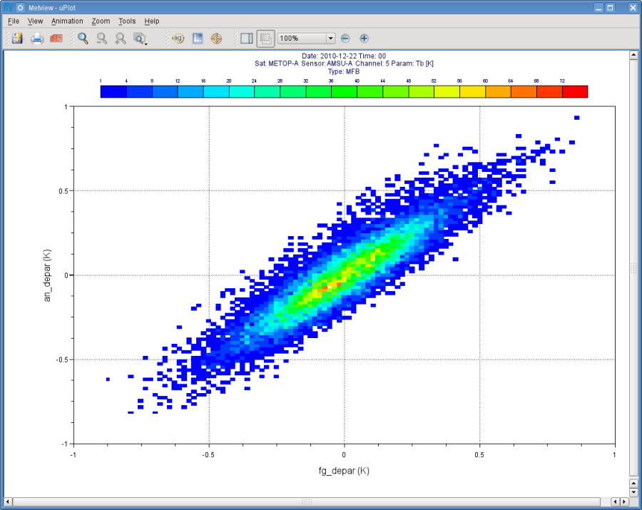
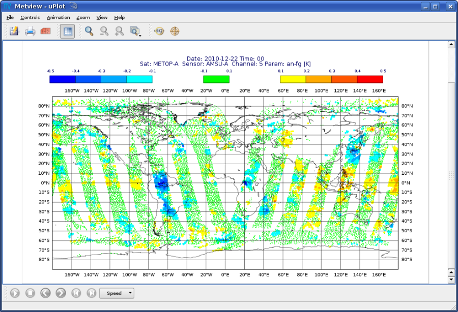
In this exercise we will generate scatter plots for the analysis and first guess departures values of brightness temperature. As in the previous exercises we will use channel 5 from our ‘AMSUA.odb’ database. Please open folder ‘scatter’ inside folder ‘odb_tutorial’ to start the work.
About Scatter Plots
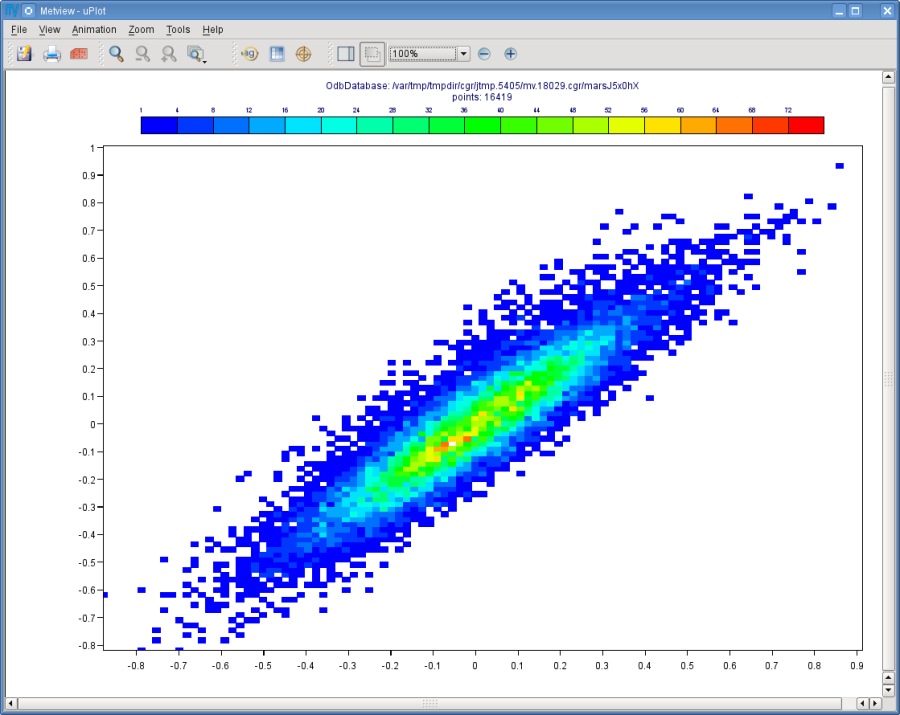
Scatter plots are used to display values in a Cartesian co-ordinate system for two variables for a set of data.
In such plots the data is visualised as a collection of points where one variable specifies the positions on the horizontal axis and the other variable specifies the positions on the vertical axis. In our case column fg_depar@body defines the data for the horizontal axis and column an_depar@body defines the data for the vertical axis.
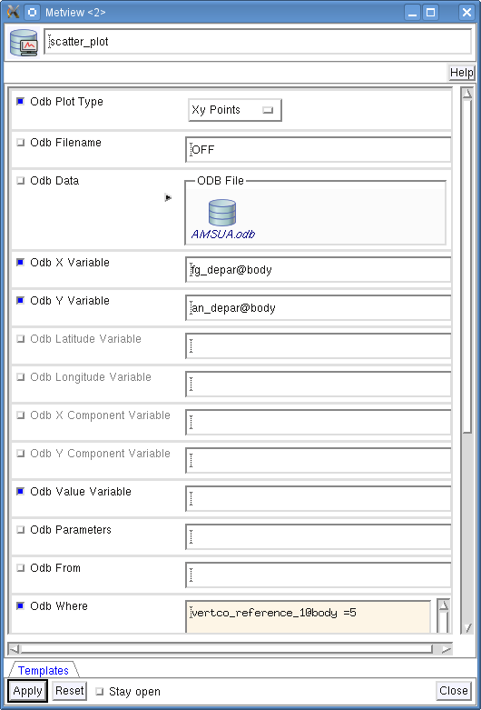
Creating an ODB Visualiser Icon
Create a new ODB Visualiser icon and rename it ‘scatter_plot’ then open its editor.
First, set ODB Plot Type to ‘Xy Points’ to indicate that we want to plot symbols in a Cartesian view.
Second, drop your ‘AMSUA.odb’ ODB Database icon into the Odb Data field. This specifies the database for which the query will be performed.
Last, specify the ODB/SQL query and the way the columns are to be interpreted to generate the plot. W e want to perform the following query:
SELECT
  fg_depar@body,
  an_depar@body,
WHERE
  vertco_reference_1@body = 5
In the ODB Visualiser interface this query cannot be typed in directly but has to be split into the following individual items:
Odb X Variable |
specifies the name of the column holding the x data in the SELECT statement (here |
Odb Y Variable |
specifies the name of the column holding the y data in the SELECT statement (here |
Odb Value Variable |
specifies the name of the column whose values will be used to generate the colour palette for the scatter plot. We will leave this item empty because we do not want to use this feature in this example. |
Odb Where |
specifies the WHERE statement. In our example it is as follows: vertco_reference_1@body = 5
|
Having finished the modifications your icon editor should look like this:
Running the Query
Save your ODB Visualiser icon (Apply) then right-click and execute to run the query. Within a few seconds the icon should turn green indicating that the retrieval was successful and has been cached. Now your icon behaves exactly like an ODB Database icon. Right-click examine to look at its content.
Visualising the Output
Right-click and visualise the icon to plot the data (please note that you can directly visualise this icon by skipping the execute step). This will bring up the Metview Display Window using the default visualisation (black circles) assigned to this kind of plots.
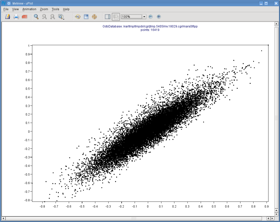
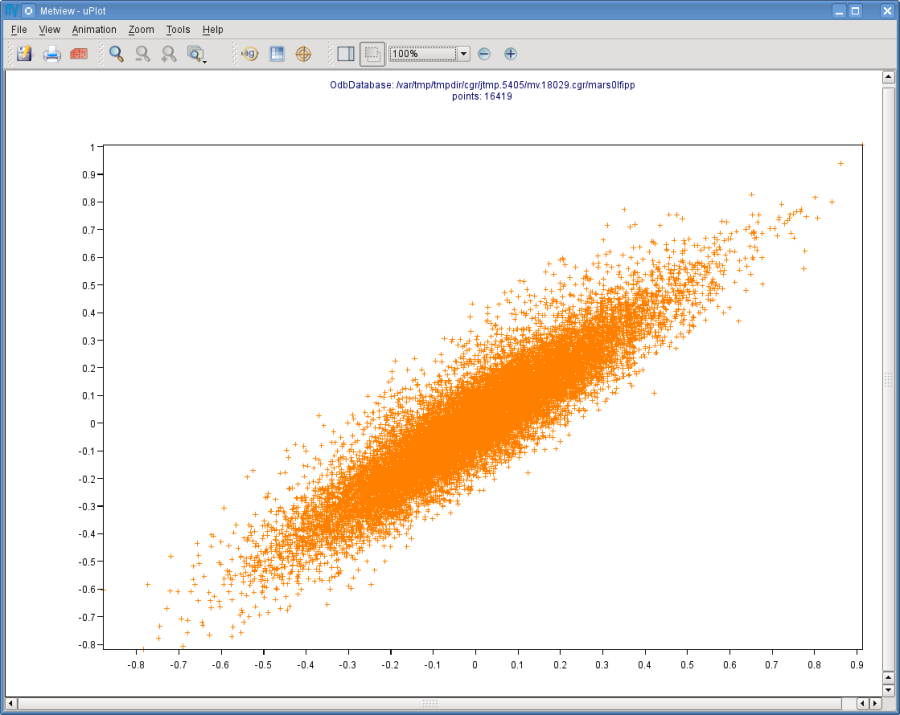
We can change the symbol (its type, colour and size) used for the plot with a Symbol Plotting icon. This time you do not need to create a new icon since there is one called ‘scatter_symbol’ already prepared for you. Edit this icon to see its settings then simply drag it into the Display Window and see how your plot has been changed.
Defining Binning
The main problem with our scatter plot is that it has dense regions where the data distribution is really hard to see. To overcome this difficulty we will create a density map out of our scatter plot. We can achieve it by turning our scattered dataset into a gridded dataset via binning. Binning means that we split the scatter plot area into grid cells by defining bins along the horizontal and vertical axes. Then for each cell we assign the number of points it contains as a grid value.
We will define the properties of the binning via the Binning icon.

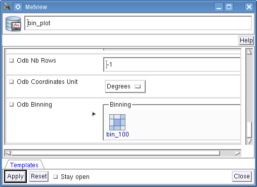
Let’s create a new Binning icon (it can be found in the Visual Definitions icon drawer, you may need to scroll the drawers to the right). Rename it ‘bin_100’ then edit it, by setting the following parameters:
Binning X Count |
100 |
Binning Y Count |
100 |
With these settings we will split the data value range for both the x and y axes into 100 bins to generate the gridded dataset.
Now we will create a new ODB Visualiser icon to be used with our Binning icon. Copy your ‘scatter_plot’ icon (either right-click + duplicate, or drag with the middle mouse button), and rename the copy ‘bin_plot’ by clicking on its title. Edit the icon and make the following changes:
Set ODB Plot Type to ‘Xy_Binning’ to indicate that we want to generate a new dataset with binning and want to plot it in a Cartesian view. Then, drop your ‘bin_100’ Binning icon into the Odb Binning field as the picture below illustrates it.
Visualising the Binned Dataset
Right-click and visualise icon ‘bin_plot’ to retrieve the data, perform the binning and plot the resulting dataset. This will bring up the Metview Display Window using the default contouring visualisation assigned to gridded datasets (your default contouring settings might be different to the one used to generate this plot).
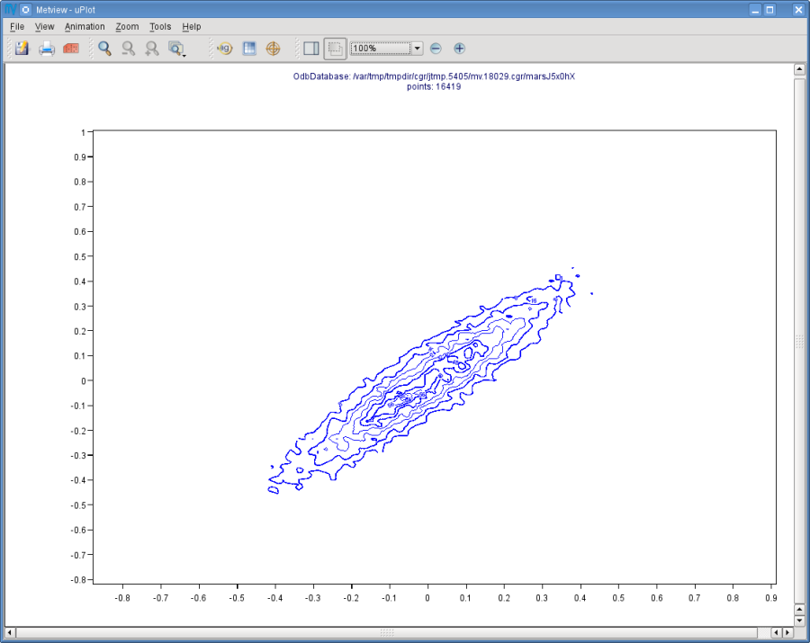
Since isolines is not the desired visualisation type in our case (our data is not smooth enough) we will to further customise the contouring settings. The best choice for us is to use grid shading since it applies shading for the grid cells themselves and we get the correct representation of our grid in the plot. (Please note that grid shading is different to cell shading, since the latter always involves an interpolation to define a new set of grid cells that the shading is applied for.)
Let’s create a new Contouring icon (it can be found in the Visual Definitions icon drawer, you may need to scroll the drawers to the right).

Rename it ‘bin_grid_shade’ then edit it, by setting the following parameters:
Legend |
On |
Contour |
Off |
Contour Level Selection Type |
Count |
Contour Reference Leve |
l0 |
Contour Min Level |
1 |
Contour Shade Min Level |
1 |
Contour Level Count |
20 |
Contour Shade |
On |
Contour Shade Technique |
Grid Shading |
Contour Shade Method |
Area Fill |
Contour Shade Max Level Colour |
Red |
Contour Shade Min Level Colour |
Blue |
Contour Shade Colour Direction |
Clockwise |
Now drop this icon into the plot to see the effect of the changes.
In our Contouring icon we set the minimum value to ‘1.’ to exclude grid cells containing no points at all and used 20 intervals between the minimum and the maximum to define the colour palette. Please note that our palette was automatically generated from a colour wheel by interpolating in clockwise direction between Contour Shade Min Level Colour and Contour Shade Max Level Colour.
Changing the View
We will further customise the plot by changing the axis value ranges and adding axis labels and grid-lines to it. To change these properties we need a Cartesian View icon (it can be found in the Visual Definitions icon drawer).

This time you do not need to create a new icon since there is one called ‘scatter_view’ already prepared for you. Edit this icon to see how the view is constructed (please note that the axis properties are defined via the embedded Horizontal Axis and Vertical Axis icons). Then simply drag it into the Display Window and see how your plot has been changed.
Changing the Title
To change the automatically generated ODB title you need to simply drag an already prepared Text Plotting icon called ‘title’ into the Display Window.
Plotting With Macro
In this example we will write the macro equivalent of the symbol plotting exercise we solved : we would like to retrieve and plot the brightness temperature for channel 5 for our ‘AMSUA.odb’ database. We will work in folder ‘tb’ again.
Basics
The implementation of ODB data plotting in Metview macro follows the same principles as in the interactive mode. In macro we work with the macro command equivalents of the ODB icons we have seen so far:
ODB Database icon: its corresponding macro command is read().
ODB Visualiser icon: its corresponding macro command is
odb_visualiser().
Another feature is that multi-line text, which we used for the WHERE statement in the ODB Visualiser icon, should be specified as a set of concatenated strings in macro. This technique is worth using if we do not want to put the (otherwise long) ODB queries into one line.
Automatic macro generation
The quickest way to generate a macro is to simply save a visualisation on screen as a Macro icon. Visualise your ODB data again, drop the symbol plotting and title icons into the plot and click on the macro icon in the tool bar of the Display Window.
Now a new Macro icon called ‘MacroFrameworkN’ is generated in your folder. Right-click visualise this icon. Now you should see your original plot reproduced.
Note
Please note that this macro is to be used primarily as a framework. Depending on the complexity of the plot macros generated in this way may not work as expected and in such cases you may need to fine-tune them manually. So, we will use an alternative way and write our macro in the macro editor.
Step 1 - Writing a macro
Since we already have all the icons for our example we will not write the macro from scratch but instead we drop the icons into the Macro editor and just re-edit the automatically generated code.
Create a new Macro icon (it can be found in the Macros icon drawer) and rename it ‘step1’. When you open the Macro editor (right-click edit) you can see that the first line contains #Metview Macro. Having this special comment in the first line helps Metview to identify the file as a macro, so we want to keep this comment in the first line.
Now position the cursor in the editor a few lines below the line of #Metview Macro. By doing so we specified the position where the icon-drop generated code will be placed. Then drop your ‘tb_plot’ ODB Visualiser icon into the Macro editor. You should see something like this (after removing the comment lines starting with # Importing):
#Metview Macro
amsua_2e_db = read("AMSUA.odb")
  tb_plot = odb_visualiser(
  odb_where: " vertco_reference_1@body = 5 ",
  odb_data: amsua_2e_odb
)
You only have to add the following command to the macro to plot the result:
plot(tb_plot)
Now, if you execute this macro (right-click execute or click on the Play button in the Macro editor) you should see a Display Window popping up with your default symbol plotting visualisation.
Step 2 - Adding More Features
Duplicate the ‘step1’ Macro icon (right-click duplicate) and rename the duplicate ‘step2’. In this step we will add our symbol plotting and title icons to the macro.
Position the cursor above the plot command in the Macro editor and drop your ‘symbol_fixed’ icon into it.
Repeat this with the ‘title’ icon. Then modify the plot command by adding these new arguments after the tb_plot variable:
plot(tb_plot,symbol_fixed,title)
Now, if you run this macro you should see your modified plot in the Display Window.
Note
The macro equivalent of the wind plotting and scatter plot exercises can be written in a very similar way to what was shown above for symbol plotting. The solutions can be found and studied in folder ‘wind_solution’ and ‘scatter_solution’, respectively.
The ODB Filter Icon
In this exercise we will learn about the ODB Filter icon.

In the previous exercises we saw how to visualise ODB data with the ODB Visualiser icon. This icon is working well for visualisation, however, it is not suitable for performing general retrievals (with more than four columns) and does not allow direct access to the retrieved values (for data processing in macro). To achieve these goals we need to use the ODB Filter icon which is able to perform arbitrary ODB queries and save the results as new ODBs on output.
The Exercise
As a demonstration of the ODB Filter icon, we will compute and plot the analysis increments in observation space for the brightness temperature. Like in the symbol plotting exercise we will work again with channel 5 from our ‘AMSUA.odb’ database. Because our database does not contain the analysis increment we will compute it as the difference of the analysis departure and the first guess departure. First, we will write and perform the query needed for the exercise via the ODB Filter icon, then we will write a macro to do the computations and plot the final result.
The ODB Filter Icon
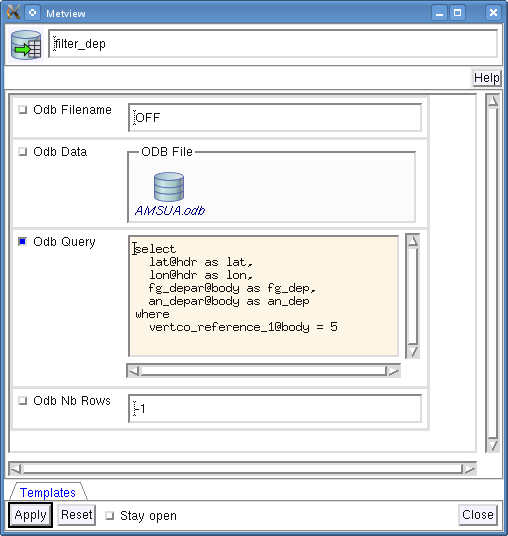
Open folder ‘filter’ inside your ‘odb_tutorial’ folder. Create a new ODB Filter icon and rename it ‘filter_dep’. Open its editor and perform the following steps:
Drop your ‘AMSUA.odb’ ODB Database icon into the Odb Data field. This specifies the database for which the query will be performed.
Type in the following ODB/SQL query in the Odb Query multi-line text input field.
SELECT
  lat@hdr as lat,
  lon@hdr as lon,
  fg_depar@body as fg_dep,
  an_depar@body as an_dep
WHERE
  vertco_reference_1@body = 5
Now your icon editor should look like this:
Note
Remarks
It is advised to use the full column names in the query because this fully complies with the SQL standards and newer versions of ODB require this as well.
We used aliases (e.g. as lat) since it highly simplifies the referencing to the columns in the visualisation and macro processing.
The ODB database for which the query is performed can be alternatively specified by the database path via the Odb Filename input field. Please note that the typed-in database path is only used by Metview if no database icon is present.
The maximum number of rows accepted in the ODB retrieval is specified in the Odb Nb Rows input field. By default (-1) there is no upper limit for the number of rows.
Running the Query
Save your ODB Filter icon (Apply) then right-click and execute to run the query. Within a few seconds the icon should turn green indicating that the retrieval was successful and has been cached. Now your icon behaves exactly like an ODB Database icon. Right-click examine to look at its content.
Now you can see that as we defined it in the query the resulting ODB contains only four columns: lat, lon, fg_dep and an_dep.
Writing a Macro
Now we will write a macro to compute the analysis increment and visualise it.
Create a new Macro icon and rename it ‘step1’.
Open the Macro editor (right-click edit) and move the cursor somewhere below the #Metview Macro line at the top.
Then drop your ‘filter_dep’ ODB Filter icon into the editor (it will generate an odb_filter() command).
You should see something like this (after removing the comment lines starting with # Importing):
#Metview Macro

amsua_2e_odb= read("AMSUA.odb")

filter_dep = odb_filter(
  odb_query: "select " &
    " lat@hdr as lat, " &
    " lon@hdr as lon, " &
    " fg_depar@body as fg_dep, " &
    " an_depar@body as an_dep " &
    "where " &
    " vertco_reference_1@body = 5 ",
  odb_data: amsua_2e_odb
)
This piece of code performs the query and stores the result in an ODB database which is now represented by the filter_dep macro variable.
Metview offers the values built-in macro function to read ODB column data into vectors.
We need all the four columns for the computations and the visualisation, so we read them all one by one:
lat = values(filter_dep,"lat")
lon = values(filter_dep,"lon")
fg_dep = values(filter_dep,"fg_dep")
an_dep = values(filter_dep,"an_dep")
Having each ODB column stored in a vector we compute the analysis increment as the difference between the analysis departure and the first guess departure. First, we allocate a vector to store the result:
num=count(lat)
incr = vector(num)
then compute the difference between the all the elements of the an_dep and fg_dep vectors:
incr = an_dep -fg_dep
The last step is the visualisation of the result.
The simplest way is to build a geopoints object out of the needed vectors (these are lat, lon and incr, respectively) and pass it to the plot command:
geo=create_geo(num,"xyv")
geo=set_latitudes(geo,lat)
geo=set_longitudes(geo,lon)
geo=set_values(geo,incr)
plot(geo)
Now, if you execute this macro (right-click execute or click on the Play button in the Macro editor) you should see a Display Window popping up with this result (your plot might look different depending on your default symbol plotting settings):
Improving the Plot
In our plot the large increments (in terms of absolute value) are not clearly highlighted because the plot is dominated by the bright green colour assigned to the near-zero values. To enhance the plot we would like to apply another colour palette by using:
green colour and small symbols for the values between -0.1 and 0.1
blue palette for the negative values below -0.1
red-to-yellow palette for the positive values above 0.1
It is complicated to create such a colour palette with one Symbol Plotting icon but we can overcome this difficulty by using three Symbol Plotting icons instead. This time you do not have to create these icons since they are already prepared for you.
Now visualise your plot again. Find the ‘sym_small, ‘sym_neg’ and ‘sym_pos’ Symbol Plotting icons in the folder and select them together - either drag a rectangle around them, or click on each whilst holding down SHIFT. Then drag them together into the plot.
In the last step drag the ‘title’ Text Plotting icon into the plot, as well.
You will see an enhanced plot as shown below:
Modifying the Macro
We are satisfied with the new colour palette and with the title as well, so in the last step of the exercise we will add these new settings to our macro.
Duplicate the ‘step1’ macro icon (right-click Duplicate) and rename the duplicate ‘step2’. Position the cursor above the plot command in the Macro editor and drop your ‘sym_small’, ‘sym_neg’, ‘sym pos’ and ‘title’ icons into it (you can drop them together or one by one).
Then modify the plot command by adding these new arguments after the geo variable:
plot(geo,sym_neg,sym_small,sym_pos,title)
Now, if you visualise the macro you should see your modified plot in the Display Window.
Wind Plotting with ODB Data
In this exercise we will present an example macro to show how to plot ODB wind data if both the wind components are stored in the same column in the database. We will demonstrate this plotting technique on aircraft wind data above 250 hPa from our ‘AIREP.odb’ ODB-2 database.
Running the Macro
Open folder ‘wind_odb2’ inside your ‘odb_tutorial’ folder. You will find here the ‘AIREP.odb’ ODB Database icon and a macro called ‘plot_wind’. If you right click and visualise the macro it will retrieve and plot the wind data from the database. You should see a Display Window popping up with the result (your plot might look different depending on your default wind plotting settings):
This result was achieved by executing the following steps in the macro:
Perform two queries: one for the u and one for the v wind component.
Get the data values from the two resulting ODBs as vectors.
Build an xy_vector geopoints object out of this data
Visualise the geopoints object
Explaining the Macro
Open the Macro editor for our macro (right-click edit) to study its source code.
The macro starts the #Metview Macro declaration.
Then we load our database into a macro object.
mydb= read("AIREP.odb")
We perform two ODB/SQL queries for this database via the odb_filter`() command.
The first query retrieves the u wind component while the second query retrieves the v wind component.
As a result we have two ODB objects: filter_u containing columns lat, lon and u, and filter_v containing columns lat, lon and v. Since the u and v wind data come strictly after each other in the database we can be sure that the two ODBs have the same number of rows and their lat and lon columns are identical.
filter_u = odb_filter(
 odb_query: "select " &
    " lat@hdr as lat, " &
    " lon@hdr as lon, " &
    " obsvalue@body as u, " &
    "where " &
    " obstype@hdr = 2 and " &
    " varno@body = 3 and "
    " vertco_reference_1@body > 25000 ",
 odb_data:myodb
 )
 filter_v = odb_filter(
 odb_query: "select " &
    " lat@hdr as lat, " &
    " lon@hdr as lon, " &
    " obsvalue@body as v, " &
    "where " &
    " obstype@hdr = 2 and " &
    " varno@body = 4 and "
    " vertco_reference_1@body > 25000 ",
 odb_data:myodb
 )
In the next step we extract the lat, lon, u and v ODB columns into vectors via the values() macro function.
lat = values(filter_u,"lat")
lon = values(filter_u,"lon")
u = values(filter_u,"u")
v = values(filter_v,"v")
Having each necessary ODB column stored in a vector we build an xy_vector geopoints object out of them.
geo=create_geo(count(lat),"xy_vector")
geo=set_latitudes(geo,lat)
geo=set_longitudes(geo,lon)
geo=set_values(geo,u)
geo=set_value2s(geo,v)
In the last step we specify our wind plotting visual definition
colour_wind = mwind( ... )
then our title
title = mtext( ... )
and visualise the geopoints object itself
plot(geo,colour_wind,title)
MARS Retrievals
In this exercise we will introduce how to retrieve ODB data from MARS in Metview.
Note
Please note that the examples presented in this chapter are not guaranteed to work for you since the MARS ODB archive is still under development and subject to changes.
The MARS Retrieval Icon
In Metview we can access ODB from MARS by using the standard MARS Retrieval icon. This icon is located in the Data Access icon drawer.

Now create a new MARS Retrieval icon by dragging it into your folder and rename it ‘mars_hirs’. We will edit this icon in order to retrieve HIRS data available for yesterday at 00 UT and also use the filter option to select only a subset of the archived columns. Our retrieval can be written as follows:
retrieve,
  class = od,
  type= MFB,
  stream = DA,
  expver= 1,
  obsgroup= hirs,
  date = -1,
  time = 00,
  filter = "select lat,lon, obsvalue, vertco_reference_1"
Now edit your MARS Retrieval icon so that it could perform this retrieval.
Please be aware that the Obsgroup parameter in the icon editor does not contain the string “hirs”. Instead it offers a list of numerical IDs. The ID of HIRS is 2.
Running the Retrieval
Save your MARS Retrieval icon (Apply) then right-click and execute to run the query. Within a few seconds the icon should turn green indicating that the retrieval was successful and has been cached.
Working with the Retrieved Data
Now your icon behaves exactly like an ODB Database icon and all the relevant techniques introduced in the previous chapters can be used with it. It means that you can examine, visualise and manipulate the data it holds.
To examine: just right-click examine to look at its content.
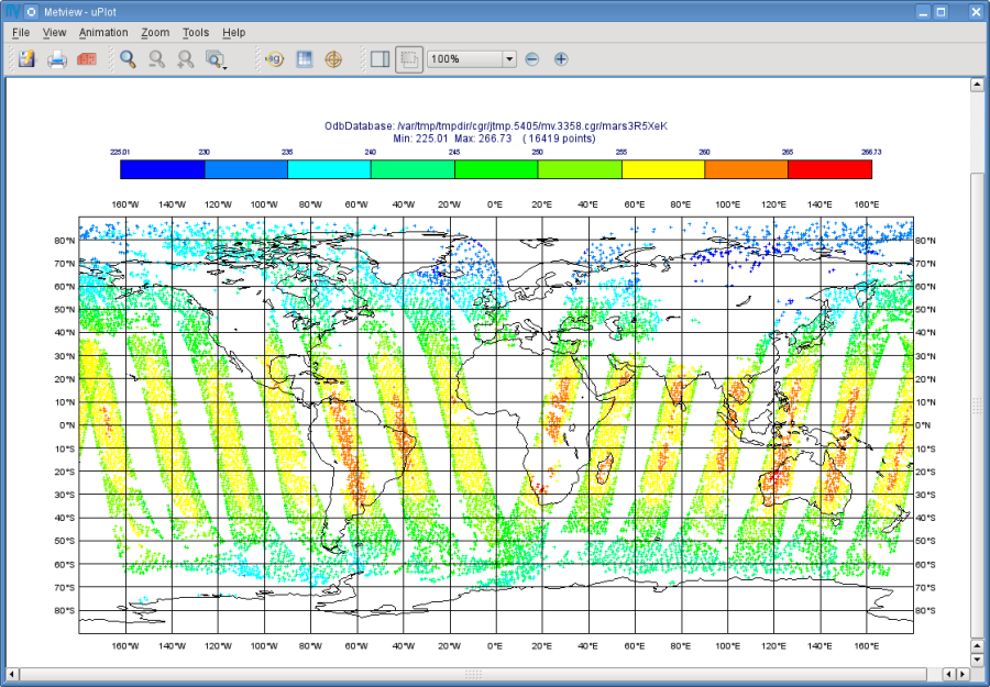
To visualise: you need to use an ODB Visualiser icon (see here). There is one, called ‘plot_hirs’, already prepared for you in the folder. It is to plot the observation values for channel 5 on a map. Just edit this icon and drop your MARS Retrieval icon into the ODB Data field. Save the icon (Apply) then right-click and visualise to generate the plot.
To manipulate: you need to write a macro (please read the next section about how to do it).
Macro Usage
The usage of ODB MARS retrievals in Metview macro follows the same principles as in the interactive mode. In macro we work with the macro command equivalent of the MARS Retrieval icon which is retrieve.
Now we will write a simple macro to retrieve our HIRS ODB data from MARS and compute and print the minimum, maximum and mean of the observed data values.
Create a new Macro icon and rename it ‘step1’. Open the Macro editor (right-click edit) and move the cursor somewhere below the #Metview Macro line at the top. Then drop your ‘mars_hirs’ icon into the editor. You should see something like this (after removing the comment lines starting with # Importing):
#Metview Macro
mars_hirs = retrieve(
 type : "mfb",
 repres : "bu",
 obsgroup : "hirs",
 time : 00,
 resol : "",
 filter : "select lat, lon, obsvalue, vertco_reference_1"
 )
This piece of code performs the retrieval and stores the result in an ODB database which is now represented by the mars_hirs macro variable.
In the next step we will use the values built-in macro function to read the ODB data values into a vector.
val = values(mars_hirs,"obsvalue@body")
The last step is to compute some statistics for vector val and print them the into the standard output.
min_v=minvalue(val)
max_v=maxvalue(val)
mean_v=mean(val)
print("min: ",min_v," max: ",max_v," mean: ",mean_v)
Now, if you execute this macro (right-click execute or click on the Play button in the Macro editor) you should see the following text appearing in the standard output:
min: 191.710006714 max: 301.720001221 mean: 238.441305601
Further Macro Examples
There are two more macro examples in the folder to show you how to use ODB MARS retrievals in Metview macro:
macro_filter: it shows how to manipulate ODB MARS data with the
odb_filter()function to derive new datasets.macro_plot: it shows how to plot data from an ODB MARS retrieval. It is basically the macro equivalent of the ‘plot_hirs’ ODB Visualiser icon