Try this notebook in ![]() .
.
Computing and plotting ENS data (GRIB)
In this notebook we will demonstrate how to:
compute and plot ENS mean and spread maps
create a stamp plot
create a spaghetti plot
compute and plot ENS probability and percentile maps
generate a CDF plot for a given location
We will use Metview and in the case of the CDF also numpy and matplotlib to achieve our goals.
Preparations
[1]:
import metview as mv
The data we work with in this notebook is related to the St Jude wind storm from 2013 October. The windgust and the 850 hPa geopotential forecast were retrieved from MARS for a few steps on a low resolution grid to provide input for the exercises. These are stored in files “fc.grib” and “ens.grib”.
Alternatively you can retrieve this data from MARS (since it is not a recent forecast the retrieval can take quite a long time).
[2]:
use_mars = False
[3]:
if use_mars:
    params = {
        "fg": {"step": [72, 78, 84], "param": "10fg3", "levtype": "sfc"},
        "z": {"step": [78], "param": "z", "levtype": "pl", "levelist": 850},
    }

    d_common = {
         "date": 20131025,
         "time": 0,
         "grid": [0.75, 0.75],
         "area": [43.5, -19.5, 66, 15.75]
         }

    g_fc = mv.Fieldset()
    g_en = mv.Fieldset()
    for v in params.values():
        g_fc.append(mv.retrieve(d_common, v, type="fc"))
        g_en.append(mv.retrieve(d_common, v, stream="enfo", type="cf"))
        g_en.append(mv.retrieve(d_common, v, stream="enfo", type="pf", number=[1,"TO", 50]))
else:
    # deterministic
    filename = "fc_storm.grib"
    if mv.exist(filename):
        g_fc = mv.read(filename)
    else:
        g_fc = mv.gallery.load_dataset(filename)
    # ens
    filename = "ens_storm.grib"
    if mv.exist(filename):
        g_en = mv.read(filename)
    else:
        g_en = mv.gallery.load_dataset(filename)
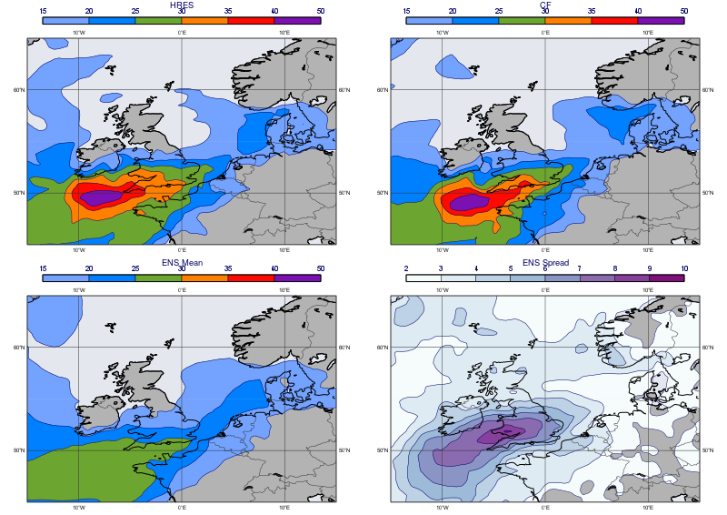
Creating an ENS plot
We will create a 2x2 plot for a given timestep (=78h) of the windgust forecast. The maps in the plot will show the following fields:
deterministic forecast
control forecast
ENS mean
ENS spread
First we read the deterministic forecast and building a title for it:
[4]:
fc = mv.read(data=g_fc, param="10fg3", step=78)
fc_title = mv.mtext(text_lines=["HRES"],
                    text_font_size=0.4)
Next we read the ENS forecast data (51 fields):
[5]:
en = mv.read(data=g_en, param="10fg3", step=78)
len(en)
[5]:
51
and check the content using grib_get() (here “cf” means control forecast, while “pf” means perturbed forecast):
[6]:
mv.grib_get(en, ['date', 'time', 'type', 'number',
                'shortName', 'step'])[:8]
[6]:
[['20131025', '0000', 'cf', '0', '10fg3', '78'],
 ['20131025', '0000', 'pf', '1', '10fg3', '78'],
 ['20131025', '0000', 'pf', '2', '10fg3', '78'],
 ['20131025', '0000', 'pf', '3', '10fg3', '78'],
 ['20131025', '0000', 'pf', '4', '10fg3', '78'],
 ['20131025', '0000', 'pf', '5', '10fg3', '78'],
 ['20131025', '0000', 'pf', '6', '10fg3', '78'],
 ['20131025', '0000', 'pf', '7', '10fg3', '78']]
We continue with reading the control forecast and making title for it:
[7]:
cf = mv.read(data=en, type="cf")
cf_title = mv.mtext(text_lines=["CF"],
                    text_font_size=0.4)
Then we compute the ensemble mean and spread and define the titles for them:
[8]:
e_mean = mv.mean(en)
e_spread = mv.stdev(en)

mean_title = mv.mtext(text_lines=["ENS Mean"],
                      text_font_size=0.4)
spread_title = mv.mtext(text_lines=["ENS Spread"],
                        text_font_size=0.4)
We need two contouring definitions for the plots: one for the windgust itself and another one for the ensemble spread:
[9]:
wgust_shade = mv.mcont(
    legend                       = "on",
    contour_line_colour          = "navy",
    contour_highlight            = "off",
    contour_level_selection_type = "level_list",
    contour_level_list           = [15,20,25,30,35,40,50],
    contour_label                = "off",
    contour_shade                = "on",
    contour_shade_colour_method  = "list",
    contour_shade_method         = "area_fill",
    contour_shade_colour_list    = ["sky","greenish_blue","avocado",
                                    "orange","orangish_red","violet"]
    )

spread_shade = mv.mcont(
    legend                       = "on",
    contour_line_colour          = "navy",
    contour_highlight            = "off",
    contour_level_selection_type = "level_list",
    contour_level_list           = [2,3,4,5,6,7,8,9,10],
    contour_label                = "off",
    contour_shade                = "on",
    contour_shade_colour_method  = "palette",
    contour_shade_method         = "area_fill",
    contour_shade_palette_name   = "m_purple_9"
    )

legend = mv.mlegend(legend_text_font_size = 0.35)
Next we define the map view and its style:
[10]:
coast = mv.mcoast(
    map_coastline_land_shade        = "on",
    map_coastline_land_shade_colour = "grey",
    map_coastline_sea_shade         = "on",
    map_coastline_sea_shade_colour  = "RGB(0.8944,0.9086,0.933)",
    map_coastline_thickness         =  2,
    map_boundaries                  = "on",
    map_boundaries_colour           = "charcoal",
    map_grid_colour                 = "charcoal",
    map_grid_longitude_increment    = 10
    )

view = mv.geoview(
    map_area_definition = 'corners',
    area = [45,-15,65,15],
    coastlines = coast
    )
Finally we define the plot layout, set the plotting target to the Jupyter notebook (we only have to do it once in a notebook) and generate the plot:
[11]:
dw = mv.plot_superpage(pages = mv.mvl_regular_layout(view,2,2,1,1))

mv.setoutput('jupyter')

mv.plot(dw[0], fc, wgust_shade, fc_title, legend,
        dw[1], cf, wgust_shade, cf_title, legend,
        dw[2], e_mean, wgust_shade, mean_title, legend,
        dw[3], e_spread, spread_shade, spread_title, legend)
[11]:
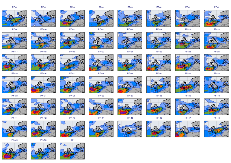
Creating a stamp plot
In a stamp plot we plot all the ensemble members into the different map within the same plot. It provides us with a quick overview on how the forecast members differ from each other.
The maps in a stamp plot will tiny so first we need to adapt the contour and map settings to this small size:
[12]:
wgust_shade_stamp = mv.mcont(
    wgust_shade,
    legend="off"
    )

coast_stamp = mv.mcoast(
    coast,
    map_label="off",
    map_grid_colour= "RGB(0.6, 0.6, 0.6)"
    )

view_stamp = mv.geoview(
    view,
    coastlines = coast_stamp,
    subpage_y_position = 17,
    subpage_y_lenght = 80
    )
Next we build a large enough layout catering for all the 51 members. We define a plot layout with 7 rows and 8 columns:
[13]:
dw = mv.plot_superpage(pages = mv.mvl_regular_layout(view_stamp,8,7,1,1, [5,100,0,100]))
Finally we generate the plot. In order to manage the great number of arguments we need for the plot() command (over 200) we use a list to build the plot contents.
[14]:
pl_lst = []

# perturbed forecats
for i in range(1, 51):
    f = mv.read(data=en, type="pf", number=i)
    title = mv.mtext(text_lines=["PF=" + str(i)], text_font_size=0.3)
    pl_lst.append([dw[i-1], f, wgust_shade_stamp, title])

# control forecats
f = mv.read(data=en, type="cf")
title = mv.mtext(text_lines=["CF"], text_font_size=0.3)
pl_lst.append([dw[50], f, wgust_shade_stamp, title])

mv.plot(pl_lst)
[14]:
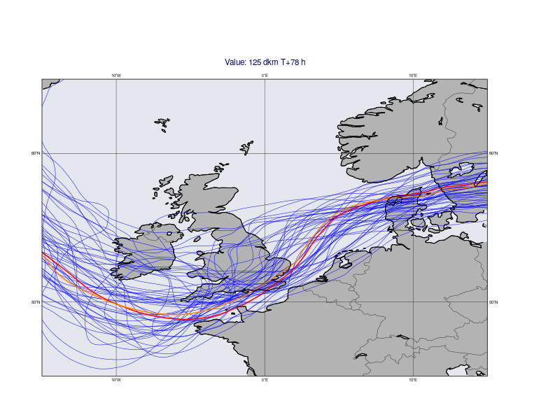
Creating a spaghetti plot
In a spaghetti plot we select an isoline value and plot that isoline into the same map from all the ensemble members. We will use the 125 dam isoline of the 850 hPa geopotential forecast since it is a good indicator of the position of the trough associated with the St Jude storm.
First we read the data and define the isolines: we will highlight the deterministic and control forecasts with a different line colour and width.
[15]:
z_en = mv.read(data=g_en, param="z", levelist=850, step=78)

cont_pf = mv.mcont(
    contour_label="off",
    contour_level_selection_type="level_list",
    contour_level_list=125,
    contour_line_colour="blue",
    contour_highlight="off",
    grib_scaling_of_derived_fields="on"
 )

cont_cf = mv.mcont(
    cont_pf,
    contour_line_colour="red",
    contour_line_thickness=3
)


cont_fc = mv.mcont(
    cont_pf,
    contour_line_colour="orange",
    contour_line_thickness=3
)
Then we use the same technique to build the plot contents as for the stamp plot. The title requires a special treatment: the implementation below is used to avoid having 52 titles (one for each ENS member + the deterministic forecast) in the plot.
[16]:
pf = []

# perturbed forecats
for i in range(1,51):
    f = mv.read(data=z_en, type="pf", number=i)
    pf.append(f)

# control forecats
cf = mv.read(data=z_en, type="cf")

# deterministic forecats
fc = mv.read(source="fc_storm.grib", param="z", level=850, step=78)

title=mv.mtext(text_line_1="Value: 125 dam T+<grib_info key='step' where='number=50' /> h",
               text_font_size=0.5 )

mv.plot(view, pf, cont_pf,
        cf, cont_cf,
        fc, cont_fc, title)
[16]:
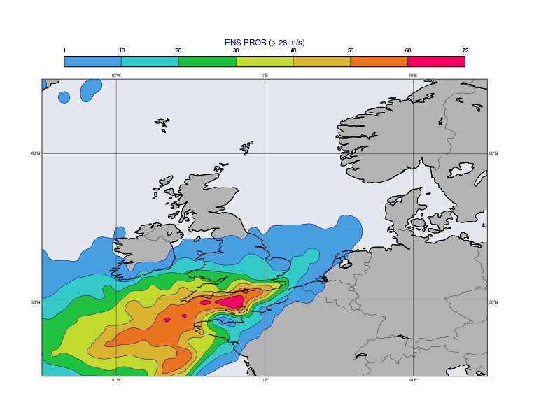
Generating a probability map
We could see in the stamp plot that quite a few ENS members predicted gale force wind close to the English Channel. We will now compute the probability of having a wind gust > 28 m/s (~100 km/h) for the given timestep. The computation itself is really simple. The first line below performs a masking turning all the grid point values into 0 or 1 according to the specified condition. Then the just take the mean to get the probabilities and scale the values into percentages:
[17]:
prob = en > 28
prob = mv.mean(prob) * 100
Next we plot the probability field with a custom contour shading and title into the same map that we used above.
[18]:
prob_shade = mv.mcont(
    legend                       = "on",
    contour_line_colour          = "navy",
    contour_highlight            = "off",
    contour_level_selection_type = "level_list",
    contour_level_list           = [1, 10, 20, 30, 40, 50, 60, 72],
    contour_label                = "off",
    contour_shade                = "on",
    contour_shade_colour_method  = "palette",
    contour_shade_method         = "area_fill",
    contour_shade_palette_name   = "eccharts_rainbow_blue_red_7"
    )

prob_title = mv.mtext(text_lines=["ENS PROB (> 28 m/s)"],
                      text_font_size=0.5)

mv.plot(view, prob, prob_shade, legend, prob_title)
[18]:
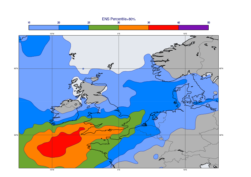
Generating a percentile map
Another way of looking at the probabilities is to use a percentile map which give us a more detailed view about the actual distribution of the ENS forecast values. In this example we will generate the percentile map for 80%. The value in each gridpoint will be the windgust value below which 80% of the ENS members fall.
[19]:
perc = mv.percentile(data=en, percentiles=80)

perc_title = mv.mtext(text_lines=["ENS Percentile=80%"],
                      text_font_size=0.5)

mv.plot(view, perc, wgust_shade, legend, perc_title)
[19]:
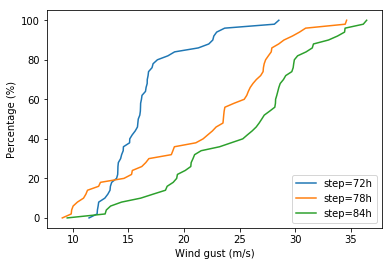
Creating a CDF plot
CDF (Cumulative Distribution Function) curves can be used to study the forecast probabilities at a given location in detail. The CDF curve constructed form ENS data tells us the probability that the forecast will be less than or equal to a given value.
In this example we will build a CDF plot for the location of Reading for 3 consecutive time steps (72, 78 and 84 h). We use Metview’s nearest_gridpoint() function tho extract the ENS values at the target location into a numpy array. Then the CDF is computed by numpy and for simpllicity the line chart is generated with matplotlib.
[20]:
import numpy as np
import matplotlib.pyplot as plt
[21]:
pos = [51.5, -1]
lines = []
for step in [72, 78, 84]:
    f = mv.read(data=g_en, param="10fg3", step=step)
    x = mv.nearest_gridpoint(f, pos)

    # form cdf
    y = np.arange(0, 101)
    x = np.percentile(x, y)

    # make line plot object
    line, = plt.plot(x, y, label="step={}h".format(step))
    lines.append(line)

plt.legend(handles=lines, loc='lower right')
plt.xlabel('Wind gust (m/s)')
plt.ylabel('Percentage (%)')
plt.show()