Try this notebook in ![]() .
.
Working with datasets
[11]:
import metview as mv
Setting the target plotting device
We want the plots to appear in the notebook. This needs to be specified only once.
[12]:
mv.setoutput("jupyter", output_width=600)
Getting the data
What is a dataset?
A dataset is simply a set of data files (GRIB and CSV) packed together with customised styles for the ease of visualisation. The GRIB data in a dataset is typically indexed providing fast access to the individual fields. Datasets are best suited for case studies and training courses where participants mainly want to focus on the scientific contents and not on the details of data access and plot customisation.
Loading the dataset
We will use a dataset called “demo” in this notebook. By default the MPY_DATASET_ROOT environmental variable defines the root directory for the Metview datasets. If it is undefined $HOME/mpy_dataset is regarded as the root. Since “demo” is a built-in dataset (hosted on a dedicated data server) it will automatically be downloaded for you on first use (this might take a minute or so).
Now, let us load the dataset:
[13]:
ds = mv.load_dataset("demo")
Dataset components
Our data is split into components (or experiments); we can get a quick overview of them by using the describe() method:
[14]:
ds.describe()
Dataset components:
[14]:
| Description | |
|---|---|
| Component | |
| an | ECMWF operational analysis |
| oper | ECMWF operational forecast |
| control | |
| track | Storm track data |
This data is related to the Hurricane Karl case in 2016 and contains analysis and forecast fields (GRIB) on a limited area alongside with some storm tracks (CSV).
We can call describe() to see what a component actually comprises:
[15]:
ds["oper"].describe()
[15]:
| parameter | typeOfLevel | level | date | time | step | paramId | class | stream | type | experimentVersionNumber |
|---|---|---|---|---|---|---|---|---|---|---|
| 10u | surface | 0 | 20160925 | 0 | 0,24,... | 165 | od | oper | fc | 0001 |
| 10v | surface | 0 | 20160925 | 0 | 0,24,... | 166 | od | oper | fc | 0001 |
| 2t | surface | 0 | 20160925 | 0 | 0,24,... | 167 | od | oper | fc | 0001 |
| eqpt | isobaricInhPa | 100,150,... | 20160925 | 0 | 0,24,... | 4 | od | oper | fc | 0001 |
| msl | surface | 0 | 20160925 | 0 | 0,24,... | 151 | od | oper | fc | 0001 |
| pt | isobaricInhPa | 100,150,... | 20160925 | 0 | 0,24,... | 3 | od | oper | fc | 0001 |
| pv | isobaricInhPa theta | 100,150,... 320 | 20160925 | 0 | 0,24,... | 60 | od | oper | fc | 0001 |
| q | isobaricInhPa | 100,150,... | 20160925 | 0 | 0,24,... | 133 | od | oper | fc | 0001 |
| r | isobaricInhPa | 100,150,... | 20160925 | 0 | 0,24,... | 157 | od | oper | fc | 0001 |
| sst | surface | 0 | 20160925 | 0 | 0,24,... | 34 | od | oper | fc | 0001 |
| t | isobaricInhPa | 100,150,... | 20160925 | 0 | 0,24,... | 130 | od | oper | fc | 0001 |
| tp | surface | 0 | 20160925 | 0 | 0,24,... | 228 | od | oper | fc | 0001 |
| u | isobaricInhPa | 100,150,... | 20160925 | 0 | 0,24,... | 131 | od | oper | fc | 0001 |
| v | isobaricInhPa | 100,150,... | 20160925 | 0 | 0,24,... | 132 | od | oper | fc | 0001 |
| vo | isobaricInhPa | 100,150,... | 20160925 | 0 | 0,24,... | 138 | od | oper | fc | 0001 |
| w | isobaricInhPa | 100,150,... | 20160925 | 0 | 0,24,... | 135 | od | oper | fc | 0001 |
| wind | isobaricInhPa | 100,150,... | 20160925 | 0 | 0,24,... | 131 | od | oper | fc | 0001 |
| wind10m | surface | 0 | 20160925 | 0 | 0,24,... | 165 | od | oper | fc | 0001 |
| wind3d | isobaricInhPa | 100,150,... | 20160925 | 0 | 0,24,... | 131 | od | oper | fc | 0001 |
| z | isobaricInhPa | 100,150,... | 20160925 | 0 | 0,24,... | 129 | od | oper | fc | 0001 |
and to inspect individual parameters:
[16]:
ds["oper"].describe("msl")
[16]:
| shortName | msl |
|---|---|
| paramId | 151 |
| typeOfLevel | surface |
| level | 0 |
| date | 20160925 |
| time | 0 |
| step | 0,24,48,72,96,120,144 |
| class | od |
| stream | oper |
| type | fc |
| experimentVersionNumber | 0001 |
Selecting data
We use select() to extract the same set of steps from the operational forecast and control experiment forecast and the matching dates/times from the analysis.
[17]:
run = mv.date("2016-09-25 00:00")
step = [0, 24, 48, 72, 96]

op = ds["oper"].select(date=run.date(), time=run.time(), step=step)
ct = ds["control"].select(date=run.date(), time=run.time(), step=step)
an = ds["an"].select(dateTime=mv.valid_date(base=run, step=step))
Variables op, ct and op are Fieldset objects.
[18]:
an
[18]:
<metview.bindings.Fieldset at 0x12012e610>
Map customistation
We will use the plot_maps() convenience function to generate map-based plots. In this chapter we will simply use it without any data and focus on the area selection and styling.
The default map plot
[19]:
mv.plot_maps()
[19]:
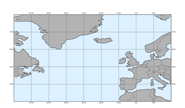
When we called load_dataset() not only the data itself became available but the dataset style configuration was also loaded making its predefined settings available for functions like plot_maps().
Our dataset defines a map area called “base” and also a map style called “base”; these two together set the default for plot_maps(). This is why we automatically got a plot on the North-Atlantic area with a grey-blue land sea shading.
Customising the map
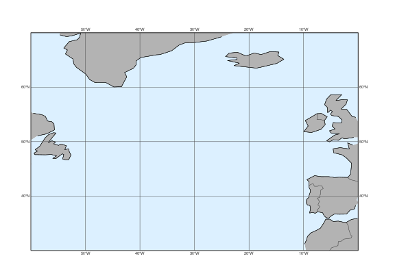
Metview has a set of predefined map areas (see map_area_gallery() for details) and our dataset also contains the areas “atl” and “nweur” on top of “base”. All these can be used with the area argument of plot_maps():
[20]:
mv.plot_maps(area="atl")
[20]:
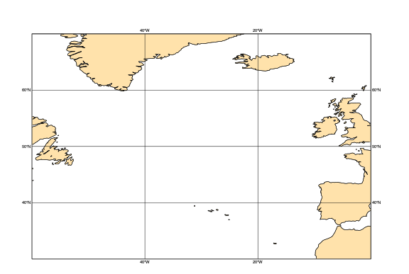
Alternatively the area can also be defined as a list of [S,W,N,W]:
[21]:
mv.plot_maps(area=[40,-20, 65, 10])
[21]:
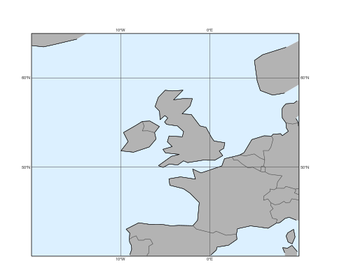
For further customisation, including the map style, we need to use the view argument with a geoview() object. The simplest way to do so is to use make_geoview():
[22]:
view = mv.make_geoview(area="atl", style="cream_land_only")
mv.plot_maps(view=view)
[22]:
Here style can be any built-in Metview map style or one from the current dataset. See map_style_gallery() for the available map styles.
Plotting GRIB data onto maps
When plotting GRIB data we would like to automatically use the right contouring/wind plotting style. The dataset we use contains a detailed data style configuration. In many cases this agrees with the predefined EcCharts style but for several parameters a custom style, better suited to given use case, is used. When we called load_dataset(), just like with the maps, the data style configuration was also loaded setting the default for plot_maps(). In the plots below we will use the style defined by the dataset.
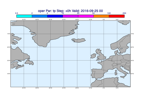
Plotting de-accumulated precipitation
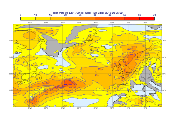
[26]:
v = op["tp"].deacc()
mv.plot_maps(v, title_font_size=0.6)
[26]:
Using a layout
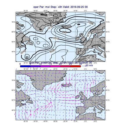
[29]:
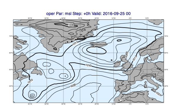
v1 = op["msl"]
v2 = op["wind10m"]
mv.plot_maps([v1], [v2])
[29]:
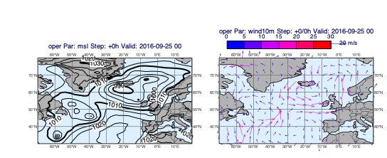
[30]:
v1 = op["msl"]
v2 = op["wind10m"]
mv.plot_maps([v1], [v2], layout="1x2")
[30]:
Plotting storm tracks
Our dataset contains some storm tracks in CSV format.
[31]:
ds["track"].describe()
Tracks:
[31]:
| Suffix | |
|---|---|
| Name | |
| final_track_op_an_KARL | .csv |
| karl_track | .csv |
| track_0910-0920 | .csv |
| track_an_1_2016_KARL | .csv |
| track_ea_1_2016 | .csv |
| track_hres_fc_KARL | .csv |
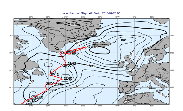
When we call select() on a track database component it returns a Track object that we can directly visualise with plot_maps().
[32]:
msl = op["msl"]
tr = ds["track"].select("final_track_op_an_KARL")
mv.plot_maps(msl, tr)
[32]:
Difference plots
To generate difference plots we will use the plot_diff_maps() function, which works in many aspects in a similar way to plot_maps(). The key difference is that it uses the “base_diff” default map_style from the dataset (instead of “base”) and the plot layout is fixed.
Basic usage
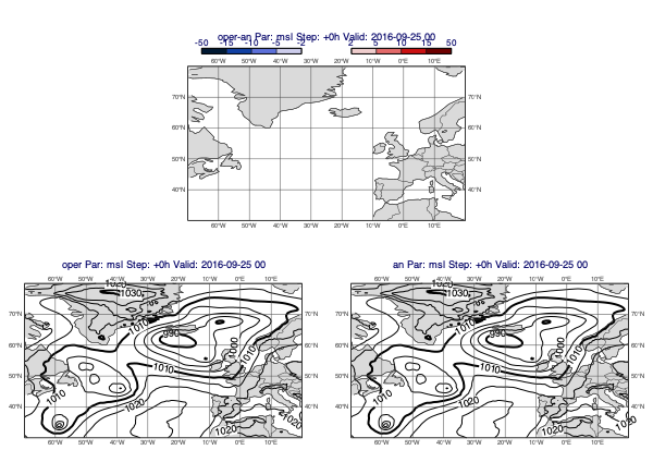
The first example is a classic forecast minus analysis plot:
[33]:
v1 = op["msl"]
v2 = an["msl"]
mv.plot_diff_maps(v1, v2)
[33]:
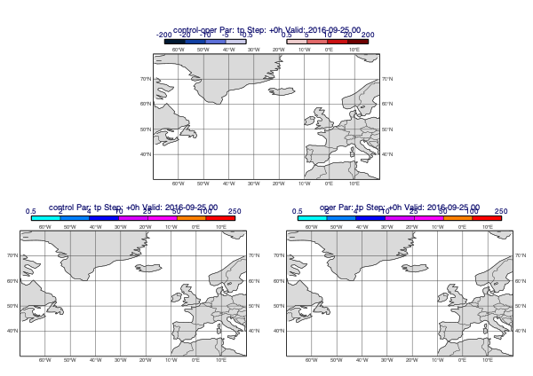
Accumulated fields
Precipitation forecasts and other accumulated fields need to be de-accumulated. The following example plots the difference between the control and operational precipitation forecasts (for 24h periods):
[34]:
v1 = ct["tp"].deacc()
v2 = op["tp"].deacc()
mv.plot_diff_maps(v1, v2)
[34]:
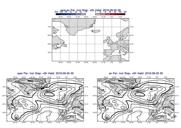
Customising the difference style
All the predefined difference contour styles use two mcont() objects; the first defining the negative value range while the other the positive one. The value ranges are symmetrical i.e. mirrored to 0. To define a new value range for the default style use the pos_values argument; it sets the positive value range and the negative one is automatically generated from it.
[35]:
v1 = op["msl"]
v2 = an["msl"]
mv.plot_diff_maps(v1, v2, pos_values=[1,2,4,6,8,10,50])
[35]:
Overlay with track
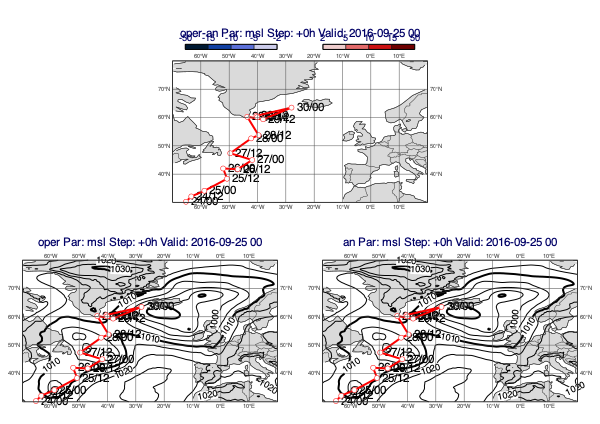
[36]:
v1 = op["msl"]
v2 = an["msl"]
tr = ds["track"].select("final_track_op_an_KARL")
mv.plot_diff_maps(v1, v2, overlay=tr, title_font_size=0.5, legend_font_size=0.4)
[36]:
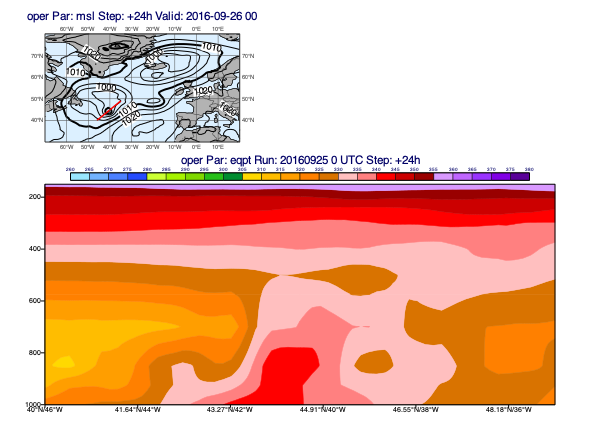
Cross sections
To generate cross sections we will use the plot_xs() function. Similarly to the previous plot_*() functions we have seen so far it also gets its default data plotting style from the database we loaded.
Cross section plotting only works for a given date/time so we select one step from the operational forecast:
[37]:
run = mv.date("2016-09-25 00:00")
step = [24]
d = ds["oper"].select(date=run.date(), time=run.time(), step=step)
The plotting goes like this:
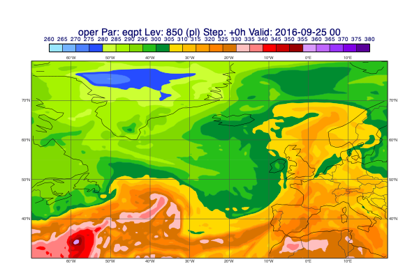
[38]:
line = [40, -46, 49, -35]
pt = d["eqpt"]
msl = d["msl"]
mv.plot_xs(pt, map_data=msl, line=line, title_font_size=0.5)
[38]:
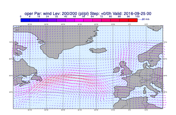
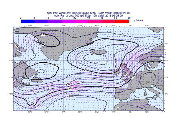
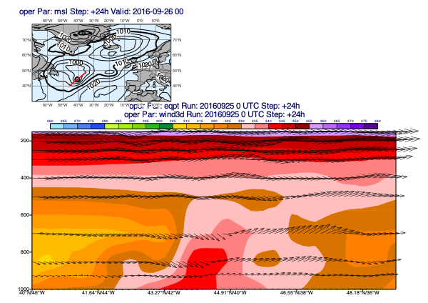
Since our data contains the 3D wind (u, v and pressure velocity (w)) it can also be plotted into the cross section:
[39]:
w = d["wind3d"]
mv.plot_xs(pt, w, map_data=msl, line=line, title_font_size=0.5)
[39]:
[ ]: